Posted on

From motivational idea to inspired mixed media painting

Every painting begins with observation.

Not simply observing a place, but allowing it to settle into psyche long enough that it begins to motivate. What remains isn’t just a mind’s image, but its experience.
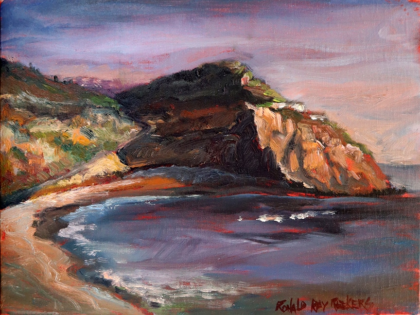
This journey began during a late afternoon painting session overlooking Crystal Cove near Laguna Beach. The sun was disappearing allowing the sky to slowly shift from warm evening light into the cool darkness of dusk. What held my attention wasn’t simply the landscape itself, but the dramatic conversation between light and shadow, warmth and coolness, and the quiet transition from one moment of painting during the day into another ambiance once finished with the plein-air.

I completed a plein-air painting on location, but I knew it was just the beginning of the aesthetic journey.

Back in the studio I created a pastel based on both the original painting and photograph I had taken. The pastel wasn’t intended to copy the plein-air study. Instead, it allowed memory to become part of the drawing. Pastel encouraged richer color, stronger contrasts, and a heightened sense of atmosphere. It became less about recording what I had seen and more about expressing what I had experienced at the location, but also as I was drawing the pastel motif.

That process of reinterpretation isn’t new to me.

Years ago, while developing my Shipley Series, I realized that returning to the same subject repeatedly revealed something unexpected. Every version solved different visual problems while opening new possibilities. My years as an aerospace engineer also influenced this way of thinking. Engineering often required breaking complex systems apart before rebuilding them into something stronger. Today I find myself approaching painting in much the same way.

The landscape becomes an idea to explore rather than a scene to duplicate.
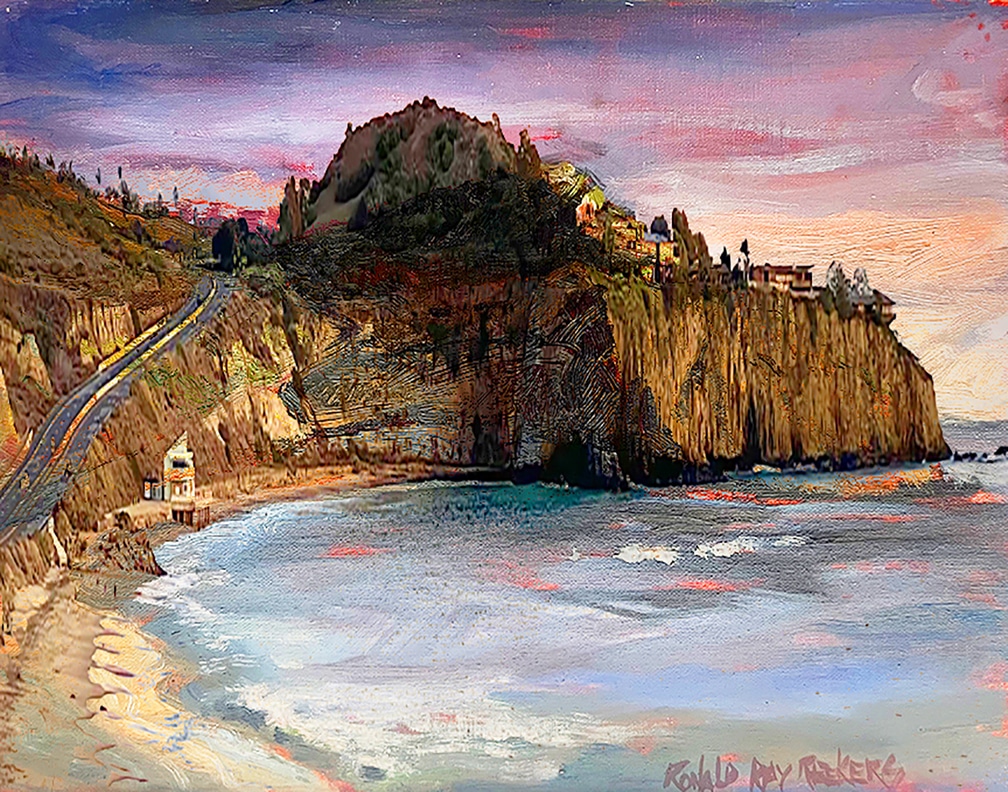
At this point I combined the photograph, the plein-air painting, and the pastel digitally—not to let the computer create the artwork, but to test visual relationships. Much like making compositional sketches or value studies, this digital stage allowed me to discover new directions before returning to the handmade mark-making process.

The resulting image became a starting point, not the destination.
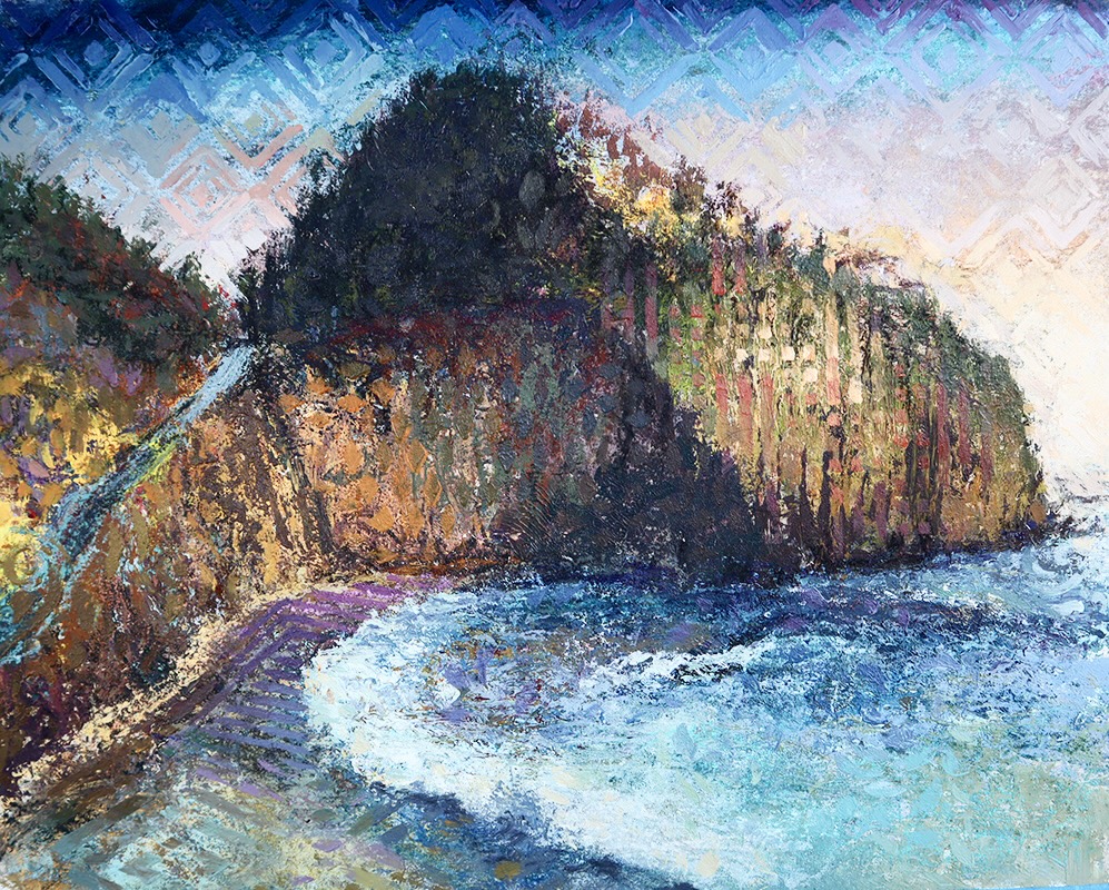
From there I transferred the image onto archival Arches watercolor paper using my gelli printing process. Layers of monoprinting, acrylic, pastel, and stencil mark-making gradually transformed the surface. Each layer concealed something while revealing something else. Rather than covering previous decisions, every stage remained visible, allowing the painting to record its own history. (You can see this process in the YouTube channel https://www.youtube.com/@rreekers.)

The final mixed media painting is not a copy of the photograph or even the original plein-air study.

It is another step in the conversation.

What excites me most about this process is that every medium asks different questions. Oil painting, pastel, printmaking, mixed media—even digital exploration—each reveals possibilities the others cannot. The subject remains familiar, yet every interpretation teaches me something new about painting, perception, and expression.

That’s why I think of my work as ideas expressed through different mediums. The medium changes, but the exploration continues.

See the

And perhaps that’s the greatest lesson I’ve learned. An artwork is rarely an ending. It’s simply the point where one idea has become clear enough to suggest the next one. Crystal Cove may yet become another oil painting, a woodblock print, or an etching. I honestly don’t know.

That’s part of the joy.

I’d love to hear how others experience this creative process. Have you ever returned to the same subject only to discover something entirely new? Or, if you’re curious about any part of my process—from plein-air painting to digital exploration to mixed media—please leave a comment or send me a message. Some of my favorite conversations have begun with a simple question.

Crystal Cove Pleinair:

Crystal Cove Pastel:

Crystal Cove Mixed media:

Follow my Mixed Media processes on my YouTube channel https://www.youtube.com/@rreekers

Watch my artistic journey on Instagram @ronreekers.

You can also explore my thoughts regarding the relationship between Fine Art, Aerospace Engineering, and lifelong creative practice through my LinkedIn profile.

For additional studio insights, behind-the-scenes artwork development, and ongoing creative projects, visit my Patreon page.

Posted on

Creating Expressive Backgrounds for a Bonsai Woodblock Print

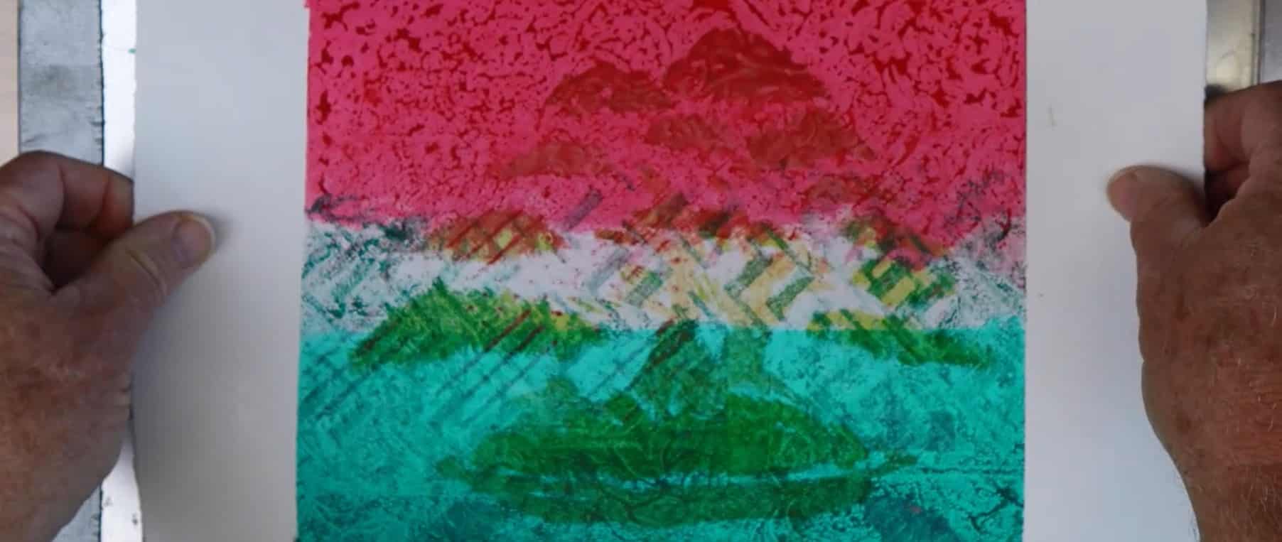
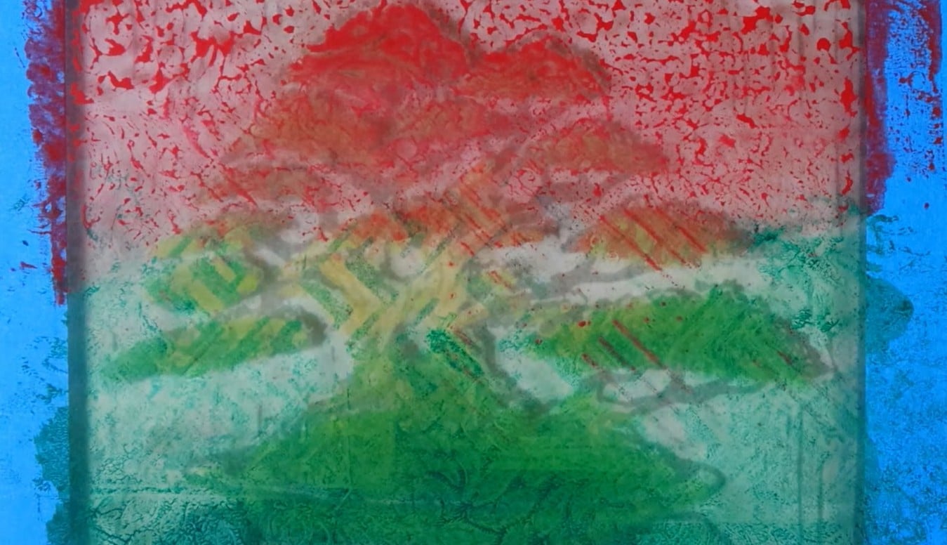
Ota Azalea Part 3 – Gelli Plate Monoprint Backgrounds

When most people think of a woodblock print, they naturally focus on the carved image. But before the first impression of the bonsai is ever printed, another important decision shapes the final artwork—the background.

For the Ota Azalea YouTube series, I wanted backgrounds that were alive with movement and color rather than the woodblock itself. The bonsai already possesses remarkable rhythm through its branching structure and flowing silhouette. The background needed to support that energy without competing with it. Rather than painting directly onto paper, I chose to work with a **gelli plate** to create a collection of one-of-a-kind monoprint backgrounds.

Why a Gelli Plate?

A gelli plate is a wonderfully direct printmaking surface. Pastel drawing and Acrylic paint are rolled onto the plate and manipulated with stencils, texture tools, or simple mark making before the image is transferred to paper. Unlike traditional relief printing, every pull from the plate is unique.

This unpredictability is exactly what makes the process exciting. Unexpected textures, soft transitions, and subtle color changes often appear that could never be planned completely in advance. Instead of fighting those surprises, I try to recognize opportunities when they occur. The result is a background that already contains its own visual life before the woodblock image is added.

Building Layers

One of the strengths of gelli printing is layering.  Each new layer can partially reveal what came before while adding fresh color, texture, and depth. Some layers become almost invisible, yet they still influence the overall harmony of the finished print.

During this process I experimented with:

* Controlled color harmonies inspired by “A Dictionary of Color Combinations”

* Transfer of Pastel to Gelli Plate

* Stencils that introduced both organic and geometric shapes

Rather than trying to duplicate one successful print, I allowed each background to develop its own personality. Some became quiet and atmospheric. Others became energetic and bold. Those differences will later influence which woodblock impressions work best on each sheet.

## Planning for the Final Print

At this stage, I am not trying to finish the artwork. Instead, I am creating possibilities. Each background becomes a candidate for the final woodblock print. Once the carved azalea is printed over these surfaces, completely new relationships begin to appear between the image and the underlying color.  Sometimes a background that seems too busy on its own becomes perfect once the woodblock organizes the composition. Other times, a subtle background allows the bonsai to become the clear focal point. This dialogue between background and foreground is one of the aspects I enjoy most about combining monoprint and relief printmaking.

## Why I Enjoy This Process

As both a painter and printmaker, I enjoy working where planning and discovery meet. The woodblock provides structure, craftsmanship, and deliberate design. The gelli plate introduces spontaneity, texture, and surprise. Together they create images that neither process could produce alone. It reminds me that printmaking is not simply about reproducing an image—it is about exploring possibilities. Every pull of the press becomes another opportunity to discover something unexpected.

## Watch the Process

In Part 3 of the Ota Azalea series, I demonstrate how I create these monoprint backgrounds using a gelli plate, pastel drawing and acrylic layered textures. You’ll see how experimentation becomes an essential part of the creative process and how these backgrounds prepare the way for the finished woodblock prints.

In Part 4, the real transformation begins as the carved Ota Azalea woodblock is printed over these expressive backgrounds, revealing how relief printing and monoprint come together to create the finished artwork.

**Have you experimented with gelli printing or combined different printmaking techniques? I’d enjoy hearing about your own experiences or answering any questions in the comments below.**

Other blogs in the The Ota Azalea Woodblock Series:

If you’d like to support this work and get deeper insight into my studio practice, you can visit my Patreon here:
https://www.patreon.com/ronreekers

Posted on

How to carve a relief Bonsai Woodblock to exciting Artist Proof.

The second chapter of my Ota Azalea video series has now been released, and this is where the process really comes to life: carving the woodblock itself. In this companion article, I want to take you deeper into the methods, tools, and artistic decisions shown in “How to Carve a Bonsai Woodblock | Ota Azalea Part 2.”

If you’ve been following along, you already know this series is about more than bonsai—it’s about translating a living form into a work of art through printmaking.

If you haven’t seen Part 1, I strongly recommend starting there, where I walk through selecting and designing the image:
https://www.reekersart.com/finding-a-strong-bonsai-image-for-exciting-energized-woodblock/

From Drawing to Carving: Moving into Commitment

In Part 1, I focused on developing the drawing—working through composition, refining the trunk and branch movement, and carefully considering negative space.

In Part 2, that freedom begins to narrow.

Once I start carving, the image is no longer fluid—it becomes fixed in wood.

Every cut matters. Every decision is permanent.

That’s one of the things I love most about woodblock printing. It demands focus, patience, and trust in the process.

My Approach to Carving the Woodblock

I use traditional relief carving techniques, working directly into the wood grain to define the image. The goal is not just to copy the drawing, but to interpret it—allowing the carving itself to bring energy into the piece.

As I carve, I focus on several key elements:

  • Trunk movement to express age and character
  • Branch taper to maintain elegance and proportion
  • Foliage masses to create rhythm and balance
  • Negative space to open up the composition
  • Surface texture to give life to the printed image

There’s also an important shift that happens here. I’m no longer just drawing a bonsai—I’m sculpting light and shadow that will later be revealed through the printmaking process.

Why I Translate Bonsai into Woodblock Prints

Bonsai has always felt like sculpture to me—living, evolving, shaped over time. Through woodblock printmaking, I’m able to reinterpret that form in a completely different medium.

The Ota Azalea was chosen for its graceful movement and strong silhouette. It has a natural rhythm that translates beautifully into line and shape.

During carving, I simplify the image—reducing it to its essential structure. What remains is movement, balance, and a sense of presence.

Creating the Artist Proof

At the end of this stage, I create an artist proof. This is a critical part of the process.

The proof allows me to see the image as a print for the first time—how the lines read, how the composition holds together, and where adjustments are needed.

Often, I’ll go back and carve more after seeing the proof. Areas may need to be opened up, strengthened, or refined.

This back-and-forth between carving and printing is where the piece really develops.

What’s Coming Next

In the next part of the series, I’ll begin exploring more experimental territory—creating unique printed backgrounds that will eventually interact with the carved image.

This is where the work starts to move beyond traditional printmaking and into mixed media.

Watch the Full Video

You can watch Part 2 here:
https://youtu.be/N699k18rAbY

Final Thoughts

For me, carving is where intention becomes reality.

A drawing can always be changed—but once a cut is made, it becomes part of the final piece. That tension is what makes the process so engaging.

Through this series, I’m not just creating a bonsai image—I’m building a body of work that reflects time, patience, and the act of making by hand.

If you’d like to support this work and get deeper insight into my studio practice, you can visit my Patreon here:
https://www.patreon.com/ronreekers

Thank you for following along—I appreciate your support.

Posted on

Finding a Strong Bonsai Image for Exciting Energized Woodblock

There is always a moment before creating a woodblock print when the image is still only an idea.

Part 1 of this new woodblock series begins not with tools — but with looking, selecting, and drawing. Before a single cut is made into the Shina plywood, I spend time finding the right bonsai image, studying its structure, and translating it into line.

This first step determines everything that follows.

The subject for this series is the Ota Azalea, a Satsuki azalea with elegant movement and delicate flowering structure.

Azaleas are different from pines or junipers. Their branching is lighter. Their energy is softer. The flowers carry visual weight that must be balanced by trunk movement and negative space.

When choosing the reference image, I look for:

  • Clear trunk movement
  • Strong root flare (nebari)
  • Layered branch structure
  • Negative space that will translate well into relief carving

A woodblock print depends on design clarity. Every line must matter.

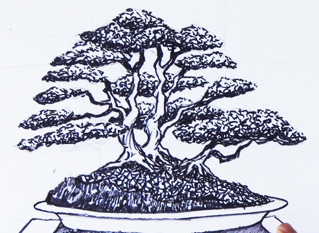
Before drawing on the block, I create a preliminary sketch.

This is where interpretation begins.

In the sketch phase, I:

  • Simplify complex branching
  • Emphasize rhythm and movement
  • Reduce visual noise
  • Strengthen silhouette

Unlike painting, woodblock printing demands commitment. Once carved, there is no going back. The drawing must already understand what will be removed and what will remain.

This is where engineering discipline meets artistic intuition — something that has informed much of my studio practice over the years.

Transferring the Image to the Woodblock

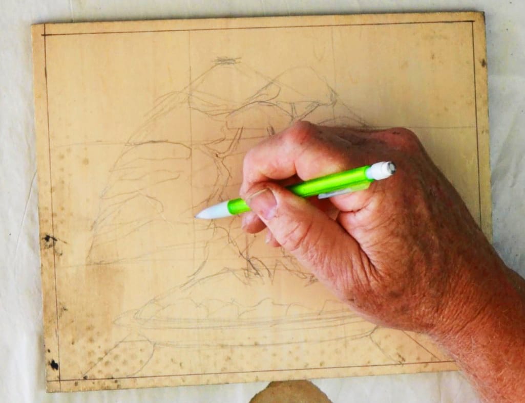
Once satisfied with the preliminary drawing, I transfer the design directly onto the Shina plywood.

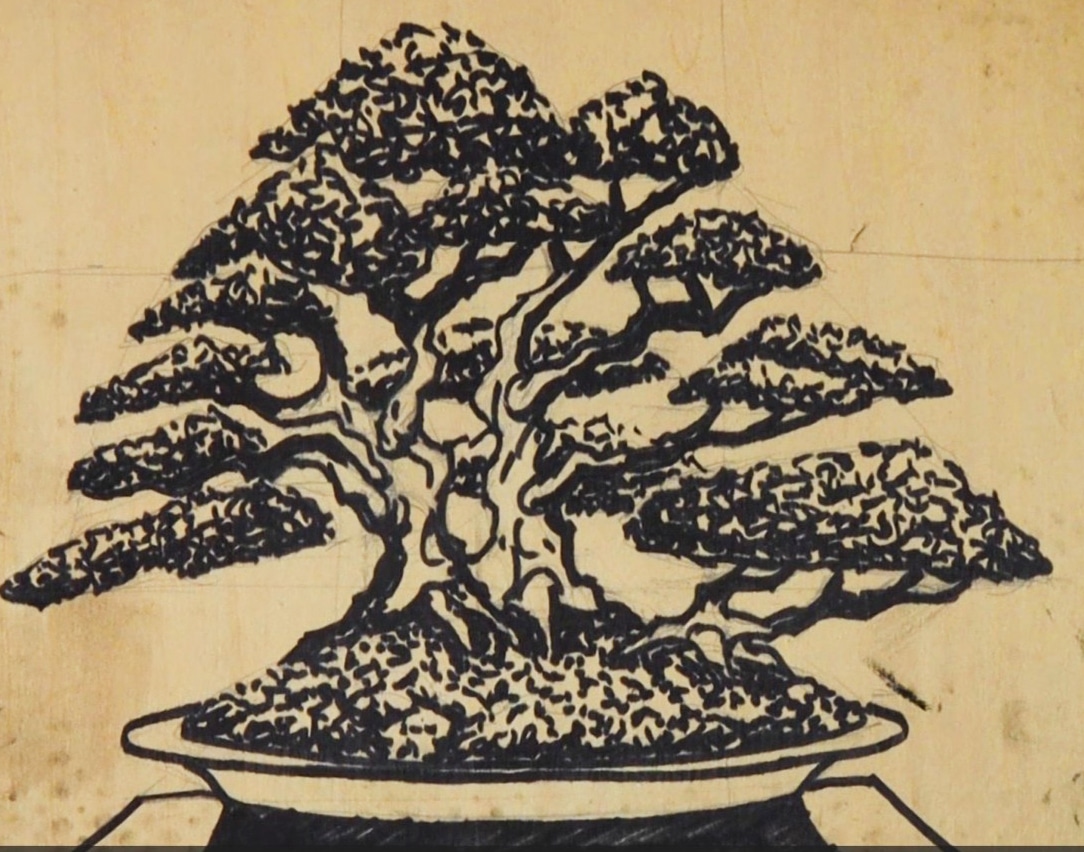
I begin in graphite to establish placement and proportion. Then I reinforce the final lines using a Sharpie marker. This darkens the areas that will remain raised and helps clarify what will be carved away in Part 2.

At this stage, the image feels complete — but it is only potential.

The drawing on the block is both fragile and powerful. It holds the entire future of the print within it.


Why This Stage Matters

Many people think carving is the most important part of relief printing.

It isn’t.

The design stage is everything.

A strong woodblock print begins with:

  • Clear line hierarchy
  • Thoughtful negative space
  • Balanced composition
  • Understanding how ink will sit on the surface

This careful beginning reflects how I approach bonsai as well — shaping, removing, refining, always thinking ahead to what the tree (or image) will become.


What Comes Next

In Part 2, I begin carving the Ota Azalea block — establishing line weight, depth, and the relief structure that will ultimately transfer the ink to the paper.

The transformation from drawing to carved surface is where the real commitment begins.

If you’re interested in the full process, you can watch Part 1 on my YouTube channel and follow along as the image evolves from idea to print.


Continuing the Exploration

Much of my woodblock discipline grew out of earlier drawing studies. If you’re interested in how I approach structure before surface, you may enjoy reading Drawing the Basic Conceptual Layout of exciting Bonsai Artwork, where I explore how careful drawing establishes the foundation for layered work.

If you would like to explore available artwork, prints, and current series, you can visit my main site at ReekersArt.com

And for those who would like to support my studio practice more directly, I share deeper process insights and behind-the-scenes work with members on https://www.patreon.com/c/ronreekers

At 68, I find myself appreciating beginnings more than ever.

The act of drawing onto the woodblock feels quiet, deliberate, and deeply connected to years of discipline — in engineering, in bonsai, and in painting.

Before the destruction of carving…
There is the stillness of drawing.

And that stillness matters.

Stay tuned for Part 2: Carving the Ota Azalea Woodblock.

Posted on

Excited to Finish the Amazing Mixed Media Artwork

With this post, I conclude my Goyomatsu White Pine mixed media series—a journey that began with a simple concept and evolved into a deeply layered artwork integrating pastel, monoprinting, kanji, and now, final mounting and presentation.

In Part 11, I take you through the final, critical steps that prepare the artwork for display:

  • I begin by revisiting the wood panel I constructed in a previous tutorial. (If you missed it, you can watch it here).
  • Using Liquitex Gloss Medium and a cheap bristle brush, I apply adhesive to both the panel and the back of the artwork.
  • I carefully center the artwork on the panel and use a brayer to secure it, eliminating bubbles and making sure the corners are properly glued.
  • After placing acetate and a masonite board on top, I let it sit under weight for a full day.
  • Once dry, I remove the cover and trim the edges with a carpet blade for a clean, professional finish.

The final touch is framing. I built a floating frame based on Michael Alm’s YouTube tutorial, then dry-fitted, shimmed, and secured the panel with wood screws. I sign the back of the artwork—preserving the image itself—and add a hanging wire to complete the piece. In some cases, I add a backing paper as well.

This step not only protects and stabilizes the work but gives it a polished presence—ready for the wall or gallery.

Reflecting on the Series

This 11-part series has been an exploration of concept, craft, and process. From the initial composition to drawing, pastel, printing, layering, painting, and now final mounting, each step was intentional and deeply connected to the soul of the subject—the Goyomatsu (White Pine) bonsai.

My hope is that this series offered both insight and inspiration, whether you’re a practicing artist, bonsai enthusiast, or curious observer. Creating something from the ground up—from sketch to frame—is both humbling and energizing.

Thank You

Thank you for walking through this entire creative process with me. If you’ve been following the series, I’d love to hear your thoughts. Has it inspired your own creative journey? What parts resonated with you most?

You can watch the final video on YouTube here:
👉 Watch Part 11 – Mounting and Framing

And if you’d like to support my work or explore available artwork, please visit:
🌐 www.reekersart.com

🎨 Become a Patron: patreon.com/ronreekers

I also share process videos and upcoming projects on Instagram @ronreekers. Let’s stay connected.

Until next time, keep creating and appreciating the beauty of the process.

Ron Reekers

Posted on

The amazing power of an honest critique — Many Eyes on Aesthetics

Every artwork reaches a moment where the artist must take a step back. In Part 10 of my Goyomatsu Mixed Media Bonsai Series, I invited a group of trusted artist friends into the studio to share their honest thoughts on the piece. These critique sessions have become an essential part of my process. There’s something invaluable about receiving input from others who can see what I might be too close to recognize—a “third eye” that brings clarity and insight.

Over time, it’s easy to lose perspective. We become so absorbed in our own work that we can miss imbalances or underdeveloped areas. That’s where the critique circle becomes powerful. It’s not just about receiving advice; it’s about engaging in a collaborative exchange with artists who bring their own years of experience and thoughtful observation to the table.

During this critique, we discussed several aspects of the work:

  • Color & Pattern Harmony: The group agreed that the color palette was vibrant and well-chosen. They also noted how the stenciled patterns enhanced the background, helping the motif feel unified—so the piece wasn’t just about the tree, but about the space it lives in.
  • Gradient & Light: There was appreciation for the vertical gradation from top to center, which strengthens the composition by helping the tree stand out.
  • Suggestions for Refinement: It was recommended that I emphasize the trunk and branching structure more clearly and deepen the negative space between the tree’s forms to improve contrast. The light in the background was praised, and it was suggested that subtle adjustments could make it even more effective in highlighting the tree.

From this input, I chose the suggestions that resonated with me—because critique is not about following every suggestion, but about listening for what rings true. I then re-engaged with the painting, setting up my palette, remixing key colors, and working on selected areas including the branches, negative space, and background lighting.

This session helped me bring the painting to a finished state—not by changing its direction, but by enhancing its clarity and cohesion. It was a reminder that honest, thoughtful critique—when done in a safe and supportive space—is one of the most generous gifts artists can offer each other.

The video concludes with a brief preview of Part 11, the final part of this series, where I’ll share how I mount the completed work for display.

I invite you to watch the video and join me in this step of the journey. And if you’re an artist yourself, I encourage you to open your work up to critique. Not every comment will apply—but the conversation is what sharpens your eye and strengthens your voice.

🎥 Watch other Parts on my YouTube Channel: https://www.youtube.com/@rreekers

📷 Instagram: @ronreekers
🌐 Website: www.reekersart.com
💌 Subscribe for blog updates and show announcements
🎨 Become a Patron: patreon.com/ronreekers

🖼 Explore More Blogs:
Visit www.reekersart.com to see the full series, read past blog entries, or explore my other mixed media bonsai works.

Posted on

Part 9 – Detail Painting, Organizing Palette, Beautiful Colors and Aesthetics

In this chapter of my How to Create a Bonsai Artwork in Mixed Media series, we move deeper into refinement. Part 9 is where I begin to paint the bonsai tree itself using acrylics—focusing on shadow, light, and the overall character of the Goyomatsu (White Pine).


🎨 From Kanji to Color: A Quick Recap

Since Part 8, I’ve worked on enhancing the background and negative space, using stencils and acrylics to lighten and darken select areas. I also stenciled over the Kanji—a key decision to better integrate the calligraphy into the composition and give it a more unified visual rhythm.

Now, my attention shifts to the tree.


🎨 Managing the Palette: Color as Structure

Before applying any paint, I walk through how I mix my palette—starting with my custom black, a blend of Alizarin Crimson and Phthalo Green. By adjusting the proportions, I can warm or cool the tone, and even neutralize it with a touch of Mars or Ivory Black.

To mix greens, I use this black as a base, then shift it with Lemon Yellow, Cadmium Red or Orange (to warm it), or Ultramarine Blue (to cool it). For lighter values, I add Titanium White. These nuanced mixtures allow for a range of naturalistic foliage tones that bring the tree to life.


🌲 Painting the Bonsai: Foliage, Pot, and Trunk

With the palette set, I begin painting:

  • Shadowed foliage and branching for depth
  • A rich, warm brown for the bonsai pot
  • Final yellow-green highlights to lift the upper foliage and give it energy

Each layer builds on the last, enhancing the overall composition without losing the sketch-like immediacy that pastel brought in the previous stage.


🖼️ Reflection and Critique

I finish this part by stepping back. I place the painting on an easel, take time to reflect, and—most importantly—I plan to bring it to my monthly artist critique group. These sessions are essential to my practice. They allow fresh eyes to offer new perspectives and help me refine the final stages of a piece.

In Part 10, I’ll share how the critique shaped the final touches and brought the work to completion.


⏱️ Video Timeline:

00:00 – Introduction
00:26 – Review of work since Part 8
01:58 – Planned work on tree
02:09 – Palette building and color mixing
04:40 – Painting tree shadows and foliage
07:53 – Highlighting the bonsai pot
09:10 – Final foliage highlights
11:26 – What’s coming in Part 10
12:48 – Support and social links


🙏 Support & Stay Connected

Thanks again for following along with this series. I continue to learn—through painting, through critique, and through your feedback. If you’d like to support or follow the journey:

📺 Watch Part 9 on YouTube: https://youtu.be/A0U1hqniwAw
📷 Instagram: @ronreekers
🌐 Website: www.reekersart.com
💌 Subscribe for blog updates and show announcements
🎨 Become a Patron: patreon.com/ronreekers

See you in Part 10—where we bring it to my critique group

Posted on

Rediscovering Exciting Forms in Pastel and Mark Making

In Part 8 of my How to Create a Bonsai Artwork in Mixed Media series, we move from destruction to reconstruction. After intentionally breaking down the image in Part 7—a moment I call “Loss”—this chapter begins the delicate act of Gaining it back.

The tree, a Goyomatsu (White Pine), begins to reemerge through the tactile medium of pastel. But first, I sketch a structural guide with Conte Crayon, which helps lay the foundation for proportion and gesture. From there, I use dark pastel tones to define shadows and shape the negative space, slowly breathing life back into the bonsai form.

This is not just about technique—it’s about creative intuition. I intentionally step back and review how far the image has evolved from its origins: a reference photo and an earlier pastel study. That gap, that transformation, is where true creativity lives.

From roots (nebari) to canopy, and even the moss at the base, I explore how warm and cool tones play off each other, subtly anchoring the tree into its imagined world.

This part also came with technical hiccups: sound issues, focus problems, and my head blocking the shot more than once. I offer a sincere apology—but also an honest acknowledgment that I’m still learning to be a better videographer and editor.

Despite these imperfections, the spirit of the work remains strong. I continue to mark the background stencil and draw out the branching, preparing the piece for the next phase. Part 9 will involve fixing the pastel and dialing in the motif with acrylic paint.

🔍 Highlights & Takeaways:

  • Rediscovering the bonsai form through pastel drawing
  • Importance of contour and negative space in composition
  • Warm vs. cool color interactions in foliage and moss
  • Creative distance from source as a tool for intuition
  • Honest reflection on the challenges of video-making

🎥 Watch Part 8 here: https://youtu.be/enLV-T8Amr8
📷 Follow along behind the scenes on Instagram: @ronreekers

📖 Haven’t seen Part 7 yet? Read the full blog https://www.reekersart.com/dynamic-loss-and-gain-how-to-use-monoprint-techniques-in-mixed-media-art/
📩 Subscribe for updates and new release

As always, thank you for being part of this journey. Each part of this series is more than a tutorial—it’s a window into a living, evolving creative process. I hope it inspires your own.

Posted on

Dynamic Loss and Gain: How to use Monoprint Techniques in Mixed Media Art

In Part 7 of my ongoing video series on creating a bonsai mixed media artwork, I explore the theme of Loss and Gain through an expressive and intuitive painting process. This stage marks a dramatic and exciting shift in the evolution of the piece, as I embrace letting go of earlier work in order to create something even more dynamic and layered.

Building from the Background

After reviewing the progress made in Part 6—where I created a vibrant background with complementary colors and stencils—I move forward with the monoprint technique. Traditionally, monoprinting involves inking a surface and placing paper on it to create a transferred image. Here, I adapt the method by applying acrylic paint to a cut plastic bag surface, pressing it onto the artwork, and drawing from the back.

The result? Organic, uncontrolled marks that partially obscure the original bonsai image. In doing so, I allow the “loss” of earlier details to set the stage for new energy and expression to “gain” life in the painting.

Inspiration and Application

My approach to this monoprint technique was partly inspired by YouTube artist Dan Tirels (visit his channel here). His process showed me how freeing it can be to let spontaneity guide the next steps.

Using this technique, I focus first on rebuilding the trunk and branching structure of the bonsai. Then, I apply color to the foliage areas, thoughtfully modulating between warm and cool hues and moving across light and dark values to create a balanced but lively surface.

Updating the Kanji and Moving Forward

Once the expressive marks are in place, I return to the Kanji symbol. To better integrate it into the new background, I mix a warm grey tone and re-stencil the Kanji onto the artwork. This small but important update helps pull the piece back together, ensuring that the elements feel united rather than disconnected.

Though happy with the results, I view this phase as another opportunity to respond intuitively to the painting, rather than aiming for “perfection.” In art, as in life, we often must embrace moments of loss to discover even greater gains.

Watch the Full Process

I invite you to watch Part 7 and see the transformation unfold. This stage is filled with insights into embracing the unexpected and letting creativity guide your hand.

📌 Watch the full video here: YouTube @rreekers
📌 Support the journey on Patreon: https://www.patreon.com/c/ronreekers
📌 Explore more of my artwork: www.reekersart.com
📌 Follow on Instagram: @ronreekers

Thank you for being part of this journey! I’d love to hear your thoughts—feel free to leave a comment or share how you approach “loss and gain” in your own creative process. Stay tuned for Part 8, where I begin to refine and define the emerging image.

Posted on

Creating an exciting painting with a beautiful background using Geometric and Organic stencils and Complimentary Colors.

In Part 6 of my video series on creating a bonsai mixed media artwork, the focus shifts to the background. This step builds on the complementary color palette I developed in Part 5. So I begin to energize the painting using layered acrylics and stencils. The result is a vibrant, supportive backdrop that enhances the bonsai image and Kanji symbol without overpowering them.

Starting with Color

I begin by reviewing the color cards selected from the marble paper and use warm tones like Cadmium Yellow Light, Raw Sienna, and Cadmium Orange, and cool tones including Cobalt Blue, Permanent Violet, and Alizarin Crimson. To control value and intensity, I use Ivory Black and Titanium White. This will allow me to lighten or darken any mixture as needed.

Choosing and Placing the Stencils

To create structure and movement in the background, I introduce two types of stencils: geometric patterns for the center and organic patterns for the top and bottom of the painting. I do this so that the geometric stencils can provide a visual counterpoint to the natural forms of the bonsai tree, while the organic stencils hint at elements like wind, clouds, grass, and waves.

Applying the Paint and Building Layers

Using a relaxed, intuitive approach, I begin applying the geometric stencils with acrylic paint in the central area of the composition. Rather than trying to be overly precise, I allow the act of painting to be a bit messy and expressive. This makes the process more enjoyable and keeps the work dynamic.

Next, I move to the top and bottom sections and begin using the organic stencils. I carefully shift the values of the paint from dark to light to keep the viewer’s eye centered on the main subject. Throughout the video, I also show how I mix on the palette to control color temperature, intensity, and value.

The Background as a Supporting Character

This part of the process is not just about adding decoration—it’s about shaping a background that acts as a strong supporting character in the composition. Through thoughtful use of color and layered patterns, the background now feels alive and integrated with the bonsai image.

Watch the Full Process

This video offers practical insights into painting technique and creative decision-making. Whether you’re working in mixed media or another medium, I hope it gives you ideas to apply in your own process.

📌 Watch the full video here: YouTube @rreekers
📌 Support the journey on Patreon: https://www.patreon.com/c/ronreekers
📌 Explore more of my artwork: www.reekersart.com
📌 Follow on Instagram: @ronreekers

Feel free to leave a comment or question—I’d love to hear your thoughts or answer anything you’re curious about. The next video, Part 7, will dive into the theme of Loss and Gain, a reflective phase of this journey.