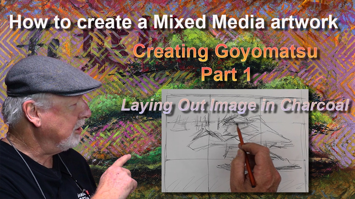
In this chapter of my How to Create a Bonsai Artwork in Mixed Media series, we move deeper into refinement. Part 9 is where I begin to paint the bonsai tree itself using acrylics—focusing on shadow, light, and the overall character of the Goyomatsu (White Pine).
🎨 From Kanji to Color: A Quick Recap
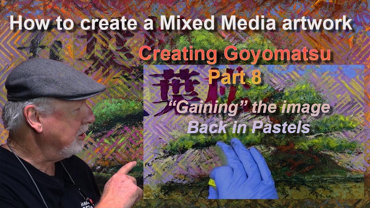
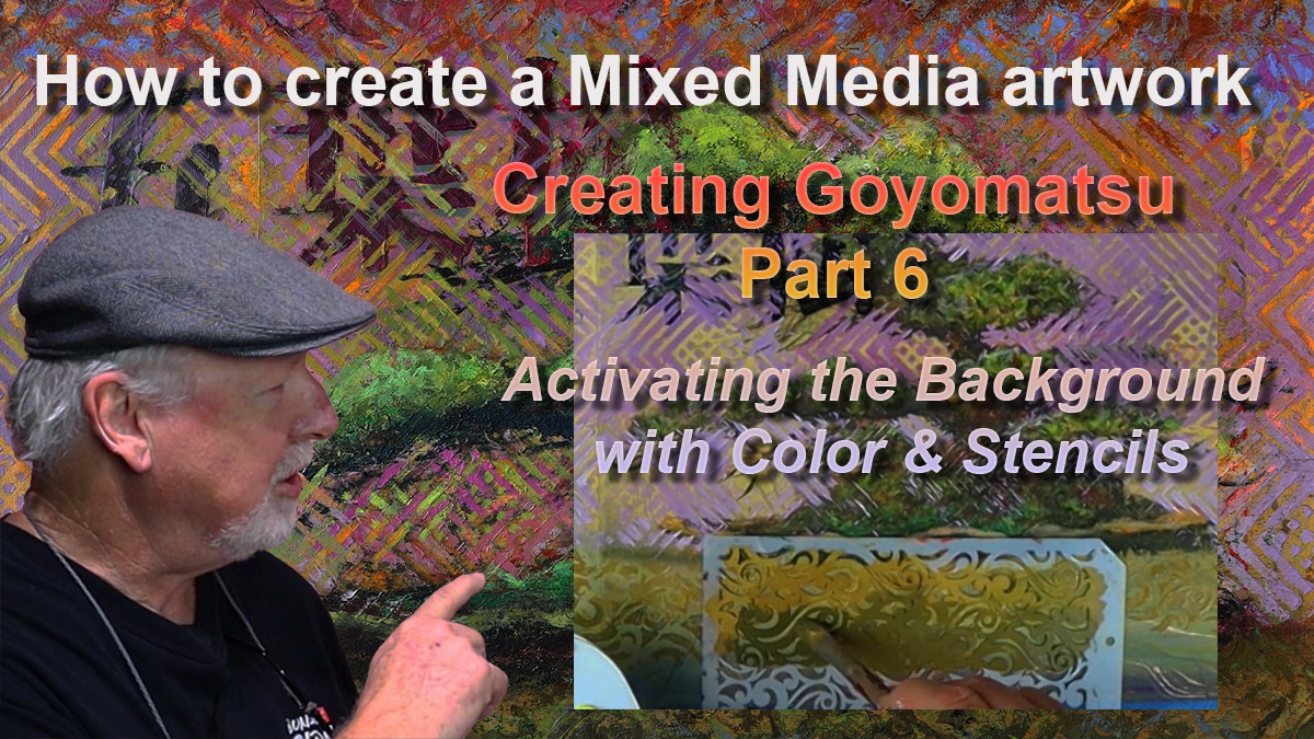
Since Part 8, I’ve worked on enhancing the background and negative space, using stencils and acrylics to lighten and darken select areas. I also stenciled over the Kanji—a key decision to better integrate the calligraphy into the composition and give it a more unified visual rhythm.
Now, my attention shifts to the tree.
🎨 Managing the Palette: Color as Structure
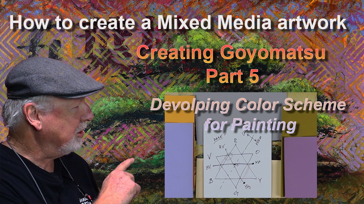
Before applying any paint, I walk through how I mix my palette—starting with my custom black, a blend of Alizarin Crimson and Phthalo Green. By adjusting the proportions, I can warm or cool the tone, and even neutralize it with a touch of Mars or Ivory Black.
To mix greens, I use this black as a base, then shift it with Lemon Yellow, Cadmium Red or Orange (to warm it), or Ultramarine Blue (to cool it). For lighter values, I add Titanium White. These nuanced mixtures allow for a range of naturalistic foliage tones that bring the tree to life.
🌲 Painting the Bonsai: Foliage, Pot, and Trunk
With the palette set, I begin painting:
- Shadowed foliage and branching for depth
- A rich, warm brown for the bonsai pot
- Final yellow-green highlights to lift the upper foliage and give it energy
Each layer builds on the last, enhancing the overall composition without losing the sketch-like immediacy that pastel brought in the previous stage.
🖼️ Reflection and Critique
I finish this part by stepping back. I place the painting on an easel, take time to reflect, and—most importantly—I plan to bring it to my monthly artist critique group. These sessions are essential to my practice. They allow fresh eyes to offer new perspectives and help me refine the final stages of a piece.
In Part 10, I’ll share how the critique shaped the final touches and brought the work to completion.
⏱️ Video Timeline:
00:00 – Introduction
00:26 – Review of work since Part 8
01:58 – Planned work on tree
02:09 – Palette building and color mixing
04:40 – Painting tree shadows and foliage
07:53 – Highlighting the bonsai pot
09:10 – Final foliage highlights
11:26 – What’s coming in Part 10
12:48 – Support and social links
🙏 Support & Stay Connected
Thanks again for following along with this series. I continue to learn—through painting, through critique, and through your feedback. If you’d like to support or follow the journey:
📺 Watch Part 9 on YouTube: https://youtu.be/A0U1hqniwAw
📷 Instagram: @ronreekers
🌐 Website: www.reekersart.com
💌 Subscribe for blog updates and show announcements
🎨 Become a Patron: patreon.com/ronreekers
See you in Part 10—where we bring it to my critique group
