Posted on

Bonsai Drawing Series – Wisteria in Pastel

This instruction video shows you how I approach bonsai drawing in pastel. I start off with a sketch on black Canson pastel paper. I like using black because it act as a line as I progress with the drawing. To do the sketch I use a red pastel pencil. The layout of the sketch is important to define how the viewer will move their eye along the artwork. This generally starts at the intersection between the trunk of the tree and the soil. I like to start with a circular motion from there and into the foliage. I find laying out the detail is also important at this stage since it will dictate the texture.

When I complete the layout, it will give me a roadmap of how to proceed with the application of the pastel. When starting with the pastel I like using the darker colors first. This creates a base in which I can start to build my colors. I will lightly blend the color into the paper. To determine the colors that I will use in the motif, I have a set of color cards and compare these cards to the base colors. This helps save time since I don’t have to search through my large array of pastels. Once I determine the colors, I can then compare the pastels to the cards. You will see how I use the side of the drawing to look at how those colors look on the black paper. I enjoy applying the pastel around the object. The negative space defines the object (positive space). I can see how well they are working together at this stage. I love the way pastel lends itself to blending. I can create a soft light and ethereal background by rubbing the color transitions.

The rest of the time is finishing the work up to your satisfaction. I like to think of this as scratching the artwork until in itches no more

Posted on

Bonsai Drawing Series – Perspective

https://youtu.be/AwSXmQxDgNA

Perspective is the way we seeing things from our point of view.  This video discusses in detail how perspective, specifically ‘Linear Perspective’, influence our Bonsai Drawing and our Bonsai development. We begin with a fundamental understanding of one-point and two-point perspective. I show how of a horizon line and vanishing points originate from our point of view and how objects occupy our ‘Field of View’; i.e why objects look larger the closer they are to you. 

Applying perspective to our drawing gives the artist the technique for showing objects in space; I illustrate this using a Bonsai Pot.  When drawing a Bonsai Tree showing the pot accurately in space can give the drawing a sense of reality. The video also discusses in detail ‘Foreshortening’ and how that influences Bonsai Artist to develop Bonsai Trees with large bases and exaggerated taper. In addition, the concept of perspective also plays a role on how l we layout our Forest Plantings called ‘Saikei’.  The video finishes with a short demo on how I trim my forest plantings and how perspective influences my decision making.

Though perspective is conceptually “easy” to understand, practically it can be very difficult to apply.  My goal in this video is to remove some of that complication and provide a simple way of applying it to our drawing and bonsai development.

Posted on

Printing an Etching – the Intaglio Process

This video is a detail instructional video on how to print from an etched plate.  The process is called “Intaglio” which is a process where the image is produced from the etched portion of the plate by apply ink to the plate. The video itself was a live video produced with the help of my friend Richard Chau-Davis and can be seen in full at https://www.crowdcast.io/e/rreekers-1.  The video is an edited version with descriptions along to way to help the viewer understand the process better. 

We start with the paper preparation and how to tear the paper instead of cutting with scissors to create the size we need.  The paper used is Arches BFK Rive, fine grain, acid free 280g, 100% cotton page (sometimes referred to a rag paper).  After the paper is torn to size we need it is put into a vat of water for approximate 20 minutes minimum.

We move to the inking station and begin the preparation of the ink.  I start by applying Art Cream Guard from Winsor Newton to my hand and putting on Latex or Nitrile gloves.  The ink used here is Graphic Chemical and Ink co. 1lb Perfect Palette Intense Black. We first begin by warming the ink up by continually mixing it on the glass palette using a putty knife.  I demonstrate the effect of the ink by adding clear oil (Huile Claire from Charbornel) which will make the ink less viscous (more runny); this is done partially if your ink is too stiff.  In order to reduce the “oiliness” of the ink I add Magnesium Carbonate purchased from Daniel Smith, it absorbs some of the oil without compromising the ink opacity.  A tack test is done by placing the putty knife on the ink and then lifting to see the length of the ink stream.  Once the right viscosity is made (personal preference) I then add Vaseline to reduce the task (stickiness of the ink), again this is done to feel.  Finally, I add Easy Wipe from Graphic Chemical and Ink co.  This will make the removal of the ink from the plate surface easier. Note: there are inks that don’t need to be modified, but in my experience, temperature and relative humidity plays a big part in the inks characteristics, so understanding these techniques for modifying your ink is important.

Once the ink is prepared I can then ink the plate using cards (collected from the mail).  I softly run the ink in all four directions to fully cover the plate.  I clean up the edges using toilet paper and then ‘stamp’ the plate using old Yellow Paper pages to further distribute the ink evenly.  In order to remove the ink from the copper surface I use Tarlatan (can be purchased at most print supply stores) and then graduate to Yellow Page paper and finally my palm (which is why I applied Guard Cream).  The fat part of the palm lightly pats the plate surface.  When all the ink from the surface is removed to my satisfaction I can now print the plate.

I have a Charles Brand press which I have preset to the height I need as well as mark the bed for the plate and paper placement.  With clean hands (I tend to wash my hands before ever touching the paper) I remove the paper from the soaking tray and blot using clean towels.   I have a large roller and usually roll back and forth about 3 times.  The damp paper is then aligned and placed over the plate.  I covered the paper with the press blankets and roll the press bar over the plate.  The final product is the print! 

A production of prints can then be made.  I make a series of 100 prints in which all prints need to be exactly the same.  I do each session in tens and remove any anomalous prints (these are later made into monoprints).  In this way, the buyer is assured to have a print of the series without flaws. In addition, the Buyer is assured I printed all prints in the series by hand.

I hope this process is clear to the viewer.  There are different methods available, but for me, this method works the best. Please email me at reekersart@gmail.com if you have any comments or questions.

Below is a list of material used in video:

Paper – Arches BFK Rives, Fine Grain, Acid Free, 100% Cotton, 280g

Vaseline Petroleum Jelly

Easy Wipe – Graphic Chemical and Ink co.

Ink – 1lb Perfect Palette Intense Black, Graphic Chemical and Ink co.

Huile Claire (Clear Oil) – Charbornel

Magnesium Carbonate – Daniel Smith

Art Guard Cream – Winsor Newton

Tarlatan

Flex Putty Knife – Huskey

Glass Scraper – Stanely

12” sq Glass Palette

Toilet Paper

Yellow Page

Cards

Latex or Nitrile Gloves

Posted on

Bonsai Drawing Series – Perception

Instructional video on understanding Perception in Bonsai Drawing

Perception is a subject studied by Philosophers and Artist throughout the ages.  Maurice Merleau-Ponty in his book ‘Phenomenology of Perception’ writes how Perception is the background of experience.  Artist looks at Perception as a relationship between what we see and a clear understanding of that experience; in our case the viewing of a Bonsai Tree.  In this video I take on that subject of Perception and how it can help you understand ‘what you see’ and translate that to a drawing descriptively and clearly.

One way of understanding “Perception” is to explore the phenomenon on how we see an object and how we interpret it in space.  As a child we draw the world flat and symbolically, whereas when we mature, and experience the world 3-dimensionally, we begin to “describe” the world more in terms of space; this is reflected in how we approach drawing.  The drawings created by the child is therefore much different that of an adult.

This video illustrates that they’re learnable tools that can help us define a descriptive space such that overlapping items, removing ambiguity, detailing and value shifting in the motif can better illustrate the tree we are drawing in a mature way. 

I sincerely hope this video clarifies your understanding of Perception in drawing and furthers your interest in our goal to help accurately draw your Bonsai tree.  Most importantly further your enjoyment of the beautiful Art of Bonsai.

Posted on Leave a comment

Bonsai Drawing Series – Types of Drawing

Instructional video on methods for drawing your Bonsai

In this video I discuss the 3 types of Bonsai drawings; Symbolic, Imaged and Descriptive. The video uses a Femina Juniper Bonsai as our ‘model’ and discusses the method for drawing in these 3 particular types, as well as the Pros and Cons for these methods.

In drawing a Bonsai Tree (or anything for that matter) we use all three types of drawing in one way or another. This video, and subsequent videos, will show how to recognize your approach and ultimately give you a good understand on how to do your own drawings within your own aesthetics.

My method is to tilted towards the descriptive way of drawing for getting a better understanding of “seeing” and a better method for understanding and visually experiencing your tree. The goal is to increase your appreciation for the beautiful world of Bonsai and help you develop the tool of drawing to increase your experience of Bonsai.

Posted on

Socal Papa Interview

This is an Interview by Diane Pendergast from the SocalPapa Pleinair painting group for an upcoming online show of Back Bay and OC Parks . Each year there is a pop-up show, but due to the corona virus on July 11th to 19th they will have an online show. There is talk of having actual pieces in the show but since the Muth Conservatory is where it is shown, it is high unlikely that it will be available.

The interview is about 7 minutes long and disusses my plienair painting experience, general ideas regarding painting outdoors in Southern California, and the painting that was submitted to the show.

Enjoy

Posted on 1 Comment

Art Critique January 2015

It’s been a few months since I wrote a blog about our critiques, so in good old fashion New Year resolution making, I rededicated myself to this effort.  We are going on 4 years of this critique and it has been an exciting fellowship of Artist.  I’m look forward to us continuing on and developing our vision and increasing our body of work.

We start with Ron Howlett’s two watercolor studies.  These are finished works of art but I call them studies because Ron mentioned that these works are more like sketches made to develop a new series of artwork.  If you follow the old blogs you can see that Ron is further developing this motif.  Before there was the chasm between his rock formations under a very dramatic sky, where the ocean acted like a silent conduit between the two.  Now the ocean has become alive and begins to be a major part of the dialog between rocks and sky.  The first watercolor “Sea Night Fall” has five rocks in the foreground within the ocean which is actionable with whitecaps and rolling waves, all contrasted with a bright sky accompanied by a storm brewing on the left.  There was little to constructively critique except with the five rock formation’s intersection between ocean and rock seems lost due to the dark shadowing; they begin to flatten out and lose some volume.

In the other watercolor “Oregon Coast” the ocean is loud with intent and rises up to make itself know to the large rock in the foreground.  It reminded us all of Winslow Homers dramatic ocean scenes which a lot of Watercolorist strive hard to achieve; Ron has done this beautifully.  There is a power that is greater than the whole in the artwork.  The combination of the powerful ocean waves and the bold strong rocks heighten the drama of nature.  The only little critique we had was creating a bit more texture in the shadow areas of the rocks, particularly the far left rock, but that is a minor issue to the greater success of creating the feeling of movement, flow of mist and the time worn battle between the rocks and the pounding ocean.

Thom’s work “Attitundal” revisits work from years past. The figure harkens back to a time when West Coast Artist were not willing to get rid of the figure for the sake of a fully abstracted piece.  They wanted to use the East Coast aesthetic of bold mark-making, but juxtapose that against saturated colors and high value shifts within a known environment or motif, like figure, still lifes or landscapes.  I suppose that is precisely the problem we saw in the piece.  There is very little contrast in the work and in the areas that that happens there are element that mute that impact.  For instance, the yellow around the figure’s head, the bright green against the figures highlighted left thigh and the value in the window which matches the interior.  We suggested exploring the window more abstractly and contrasting the interior with the exterior through value.  This is not unprecedented, there is a long history in art where exterior and interiors are contrasted and become a major part of the motif.  On the other hand, we really like the mark-making that Thom had started and his always unique approach to balancing compositions with line and interesting shapes.  We look forward to see how he resolves the piece.

I ‘finally’ finish my last Shipley Center painting.  Last year I had a few distraction so it took some time to finish this piece (I’m still attempting to relieve myself from these distractions).  In fact, it was the only major piece I did all year!  In any case, it was well received and by showing it each critique it gave the group a chance to see my process (or madness) when it comes to building up layers of paint and abstracting from what I had previously learned by going out and doing a plein air painting of the same scene (in this case 6 times during the year) and then putting into practice what I had learned.  As a side note, I’m starting a new series of plein air paintings at the Shipley Nature Center and I found a new spot there.  Now I need to dedicate myself to getting out there each month.  In any case, I like the finished piece which is called “Sage Mound”.

I hope you enjoyed the blog, and we look forward to reading your comments, and a perhaps joining us in 2015.

Posted on Leave a comment

Art Critique May 2014

May’s critique welcomed two new members and of course they contributed wonderfully with the group.  Much of what we presented and talked about was our community with the world around us, and in particular the ‘natural’ world.

Thom brought a dynamic painting focused on how two worlds can influence on each other.  This paintings graphically describe the dramatic phenomenon of plate tectonics.  The patterns and texture of the surface are beautifully rendered and add an interesting approach to the idea.  The texture was greatly enhance by the cutting of the surface and glued on backing structure, which gave one the direct effect of a fractured surface.  The upper right globe is a bit subdued and bringing up the saturation and mark making would help the object work with the larger more dominate globe.  The white between the two planets was skillfully done and adds to the understanding of space within the work.

Jim just started with the group and brought a few well-conceived pleinair paintings.  The color composition of the painting shown in the blog works very well with the type of back lighting affect one sees in the piece.   The value structure of the work could be settled by darkening up the shadow edges and bringing more of the background light into the foreground objects.   But all together, there are some very hard fought colors in the rock shadow and background sky that make the painting an enjoyable experience to view and ponder over.

Jared is back from his residency in the Netherlands and brought some thought provoking photos.  These are photo from a museum out to the street, which brings up the idea of art discovery (and too me ‘irony’).  The irony being that he is in a museum to see the unbelievable artwork from the Dutch Masters and instead takes pictures of a rough surface glass of the outside.  Beside the irony though, these are interest works of art on their own merit.  There is a Diebenkorn feel to these photos and on a pure color/composition they work wonderfully.  The problem will be context though, and how these photos are sized and shown on the wall will require a lot of thought and care.

Pat is another new member and she brought a very personal painting.  It is sometime difficult to do a critique on artwork of a very personal nature, but done properly can be very cathartic and insightful for the Artist.  We all just loved the little girl, there is something very intimate in the pose and the eating of the apple that gives the viewer a feeling of comfort and joy.  The trees in the background is also very well done, though the tree on the left stop the viewer and over powers the left-side composition; removal would be potentially good.  The paint does lack richness but only because of a lack of paint on the surface.  In order to help saturate the surface and allow the painted surface to be richer with mark making and texture we suggested adding more paint, but to be careful not to change the color or value.

Having two new members was a great joy for everyone.  The more the merrier I say.  In any case, we look forward to share our time with them and anyone else that would like to join our critique.

Au revoir

Posted on 1 Comment

Art Critique March 2014

This month we had a very eclectic group of art which often provoke the greatest amount of discussion, especial focused on art making and processes.  All participates seem to draw from nature, but in much different ways of expression and feeling.

Donna presented a group of ‘ghost prints’ of waterfalls, or an idea of a waterfall.  These are built works developed from ink jet transfers, mono-printing in ink and drawn over repeatedly as she is working the idea.  We found these ‘prints’ to be very original and speak most about the self and how one feels within the elements of water, plant life and earth.  Yet on the other hand, they seem very solitary, or without human presence which highlights the idea of an untouched ebb and flow of nature. These are very delicate work and bode very well as a series, the difficulty will be in the way she chooses to present them; framed, floated, cut edge or broken and viewing level.

The manner in which Donna approached the work harkened back to a series of monoprints I did of Yellowstone. I had been working on a series of views from a car and the original photo inspired me to explore the image further. It is of an elderly women walking toward the hot springs in Yellowstone where steams and the mountain environment are active in the background.  Most of the group was interested in process and how one can create a plethora of feelings just by the act of making the image; there are a total of eight of them (you can see all eight at http://reekersart.com/012YosRevisit.html) each inspired and pushed the other; this is the beauty of the mono-print technique.

Jared will be going to Holland and so in preparation did a series of images of streets named after cities in the Netherlands and kitschy images of windmills from miniature golf courses.  These are highly conceptual ideas and sparked a discussion of pre-actual-post effect of the residency he is to experience.  If one has never been out of the United States, one tends to have a preconceived, and most often narrow view, of the world outside, but once experienced in world travel those ideas fade away and are replace (as in my case) with a more thorough and enlightened idea of the world outside our familiar existence. We are sure this experience will play well into his future work.

Thom brought a cubist painting focused on Global Warming (GW) and its direct killing effect on trees. The work is executed with a cubist style and the color was of a mostly bright warm palette.  The wonderful colors used seemed to contrast against the pessimistic view of our effect on the world’s climate and the subject trees. To bring the harsh impact from GW back into focus we suggest applying more aggressive mark making around the subject thereby imposing violently on the trees as opposed to the current more playful marks that frame them.   On the other hand, Thom’s whimsical style (note the smiles and lollipop trees in the composition) may better be served to turn the pessimism of GW to the optimism of recover (may be asking a lot) and thus perhaps giving an ironic tone to the work.

These critiques continue to provoke ideas and bring into focus the environment in which we all live in, and most importantly for us, how this is translated into art-making

Posted on 1 Comment

Art Critique Feburary 2014

We had six attendees this month that included a wide variety of media and styles.

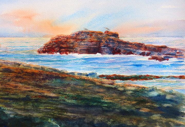
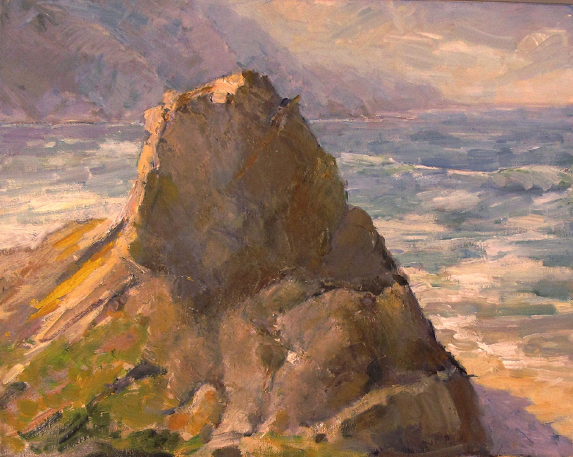
Ron presented three beachscapes (about a quarter sheet size), based on some plein-air painting on the coast of Laguna Beach. Comments were about the rich color and brushwork were used to capture the rocky island and foreground structure. All of them were well composed and well painted, using horizontal bands for the beach, shore, island, distant sea and sky. Discussions concerned primarily the relative simplicity of the clouds and sky versus the rocks, and ways to add additional detail and structure to clouds without overcomplicating them. Good background glow worked very well in all of them.

Donna first presented an excellent monoprint that she had made in an art class at OCC in 2004. It portrayed a semi-abstract view of a waterfall with scattered vegetation. There was a wide variety of marks, colors and textures that created all-over, multi-layered surfaces. We agreed that it was finished and not much more should be done. Her second piece was a large, mixed-media work portraying an all-over color field of stone shapes and surface markings, which included oil pastel. The rich, detailed shapes worked nicely up close, but lacked a spatial hierarchy of rhythm and movement. Several possibilities for improvement were discussed, including collage, geometric grid, open spaces, lean to detailed drawing such as in the works of Julie Mehretru, and reworking for a variation of pattern.

Jared presented a group of three, small, color photographs in vertical format and horizontal sequence, with a small, transparent, plastic throw-away camera mounted at the end of the photos. This work was his first art project done recently in his photography class whose assignment was an artistic narrative of a location. The photos presented a parking lot on Beach Blvd where a sculpture exhibition was placed. The black asphalt lot was adjacent to a yellow stucco house, with what looked like white marble statues of a Greek goddess. The photos presented a distant to close-up sequence of one cropped-view statue, using the yellow house and black asphalt surface to good effect to frame the context of each view.

Positive comments were that the photos and the zoom-in sequence provided a temporal dimension that worked well, that the black/yellow/white colors worked well together, and that the art-sale location was clear and yet mysterious as to the focus on one female statue. No title was given as a context. Another suggestion was made to move the multi-color photo to the front to begin the sequence and end the sequence with the close-ups of two views of the house. Another suggestion was to add another sheet with some text description or narration that adds both detail, drama and/or mystery.

Thom presented two recent small works in his “Earth Tree” series, concerning large trees of the earth as they relate to the welfare of humanity and nature. The first work was in a new and experimental painting style for him. It used a bright red canvas ground with multiple, horizontal bands of color with broken edges between them to show the red ground.  Positive comments were made about the richness of color and the semi-abstract character of the background with the broken red lines between them. However, the foliage of the tree top was not effective in suggesting a canopy with volume and sky light.

Thom’s second work was in his Cubist/Expressionist style in a square format. Critique comments were that the main tree was interesting, but that the gestural style side trees were too different for the composition to hold together. Also, the background brown color was too dark and did not integrate with the tree shape.

Andrew presented three, abstract, medium sized paintings in oil in vertical formats. The first two were reworked that have been previously seen and critiqued. Positive comments were that these present a unique style and meditative, painted in a confident style of subtle color fields, overlaid with patterns of brush marks of luminous color and in a variety of sizes and shapes. There are multiple layers of space suggested in a playful and intuitive manner. Andrew described these open compositions as analogous to his music.

The third painting was more structured in shape and ground relationship that he described as figurative. The subtle contrasts were painted using only four colors – black, white, red ochre and lead white. One influence in his work is Paul Klee. Comments were made that the frame detracted from the work, that some areas were too subtle so as to be almost empty and in a dull greyed tone. This was debated as to the nature of how to portray silence, quietness and the degree of subtlety that communicates with an art audience that has an experience with Western art tradition. Our art tradition permits the painter full freedom and license to follow his own direction. However, quiet paintings may take time to appreciate.

Hosted by Ron Reekers, notes by Thom Wright.