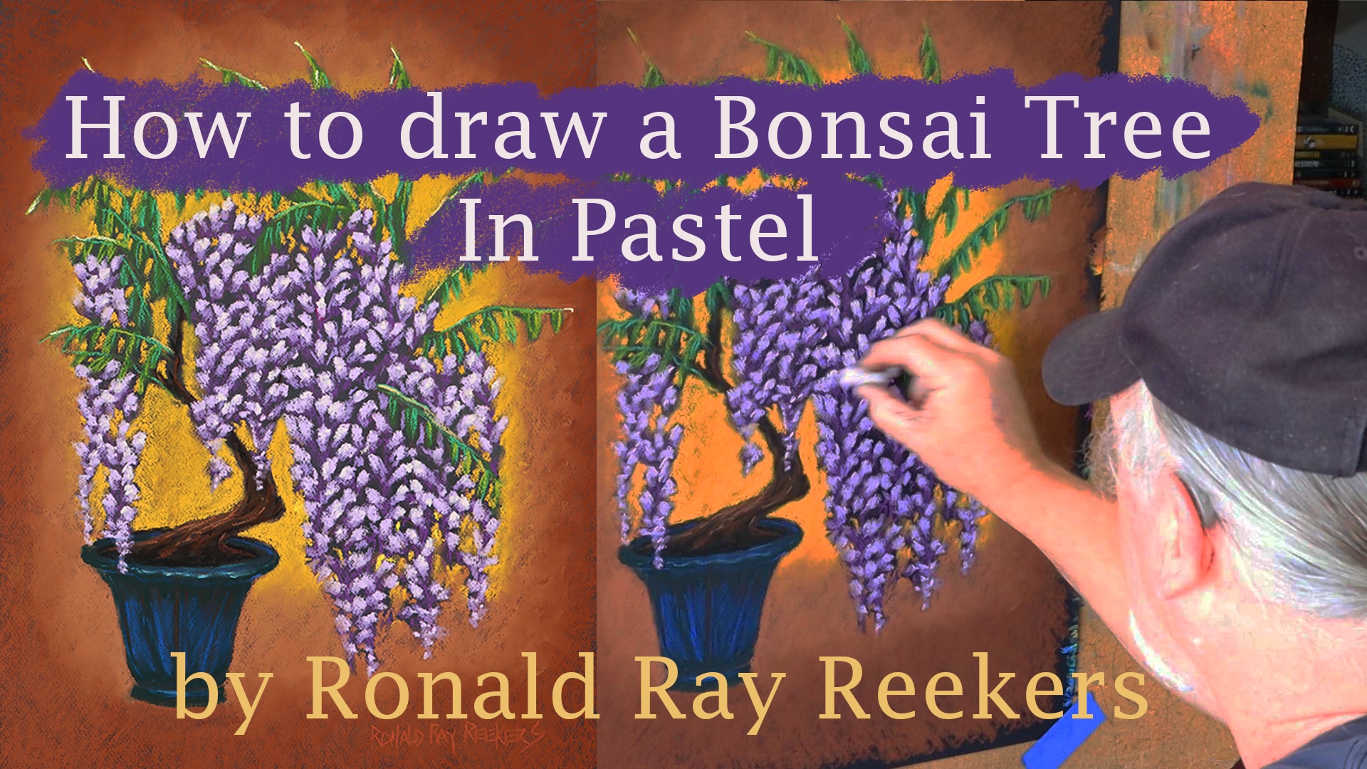
This instruction video shows you how I approach bonsai drawing in pastel. I start off with a sketch on black Canson pastel paper. I like using black because it act as a line as I progress with the drawing. To do the sketch I use a red pastel pencil. The layout of the sketch is important to define how the viewer will move their eye along the artwork. This generally starts at the intersection between the trunk of the tree and the soil. I like to start with a circular motion from there and into the foliage. I find laying out the detail is also important at this stage since it will dictate the texture.
When I complete the layout, it will give me a roadmap of how to proceed with the application of the pastel. When starting with the pastel I like using the darker colors first. This creates a base in which I can start to build my colors. I will lightly blend the color into the paper. To determine the colors that I will use in the motif, I have a set of color cards and compare these cards to the base colors. This helps save time since I don’t have to search through my large array of pastels. Once I determine the colors, I can then compare the pastels to the cards. You will see how I use the side of the drawing to look at how those colors look on the black paper. I enjoy applying the pastel around the object. The negative space defines the object (positive space). I can see how well they are working together at this stage. I love the way pastel lends itself to blending. I can create a soft light and ethereal background by rubbing the color transitions.
The rest of the time is finishing the work up to your satisfaction. I like to think of this as scratching the artwork until in itches no more
