Perspective is the way we seeing things from our point of view. This video discusses in detail how perspective, specifically ‘Linear Perspective’, influence our Bonsai Drawing and our Bonsai development. We begin with a fundamental understanding of one-point and two-point perspective. I show how of a horizon line and vanishing points originate from our point of view and how objects occupy our ‘Field of View’; i.e why objects look larger the closer they are to you.
Applying perspective to our drawing gives the artist the technique for showing objects in space; I illustrate this using a Bonsai Pot. When drawing a Bonsai Tree showing the pot accurately in space can give the drawing a sense of reality. The video also discusses in detail ‘Foreshortening’ and how that influences Bonsai Artist to develop Bonsai Trees with large bases and exaggerated taper. In addition, the concept of perspective also plays a role on how l we layout our Forest Plantings called ‘Saikei’. The video finishes with a short demo on how I trim my forest plantings and how perspective influences my decision making.
Though perspective is conceptually “easy” to understand, practically it can be very difficult to apply. My goal in this video is to remove some of that complication and provide a simple way of applying it to our drawing and bonsai development.
In 2011 I started on a journey that continues to this day. Below is an account of the start of this journey into a life time at the Shipley Nature Center in Huntington Beach
If you are interested in purchasing one of the pleinairs please contact me at reekersart@gmail.com and I let you know availability. Purchase price is $300 with free shipping.
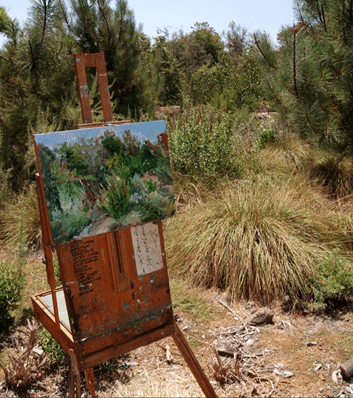
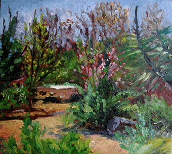
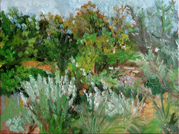
Pleinair setup at Spot 13, sometime in 2011
The conceived of this series as a way to understand how nature changes with time here in Southern California, and how my learning of the scene changes with it. The goal is to have completed a series of 12 paintings that illustrate how art can be used as a learning tool and accomplish great esthetics when one understands and feels a vista. The agenda will be to go out the the Shipley Nature Center in Huntington Beach California and paint a plienaire painting (on-location) every month. It is important to paint from the same spot every time; Spot 13 as disignated by a marker at the Center. My intent is to finish this location completely with studio work to be performed in 2012.
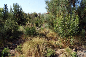
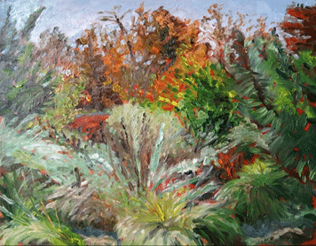
This is a photo of the scene taken in July 2011, it gives you a general idea of the Spot 13. I choose the spot because I wanted a location that was foliage rich and not your ‘traditional’ landscape vista. In this way, I would have to respond to the changing of the natural foliage throughout the year.
January 2011 – Pleinair 9″ X 11″ oil
This was the first painting at Shipley. It was an introduction to the scene and place. What I like about this painting is the light moving through the scene and the brushstroke are looser than my past pleinair paintings.
Feburary 2011 – Pleinair 9″ X 11″ oil
Trees are beginning to fill out though relatively spares. Some flower’s are beginning to bloom which was exciting and began to saturate my pallet. I like how things are beginning to warm up and those violet flowers.
March 2011 – Pleinair 9″ X 11″ oil
A very strange day, the clouds were heavy and there was a constant change in light. The foreground continues to be expressly derived and the middle ground is looking more distinct and integrated.
April 2011 – Pleinair 9″ X 11″ oil
This was a very melancholy day and rather dark. It seems the changing of the season is creating a level of anticipation in the plants. I learned a lot on this trip, more what not to do than what to do though. Having been more familiar with the scene I thought that I could blocked in the scene quickly and then free-form on details. I ended up trying not to muddy up the painting from the under paint. In any case I like the energetic mark making.
May 2011 – Pleinair 9″ X 11″ oil
An absolute beautiful day; the best so far. The flowers buds look happy and ready to bloom, the foliage is filling out and finally the background trees are full and robust. The previous month taught me much about approaching the scene in a holistic manner. I was not worried about blocking in and allowed the under stain to peak through.
June 2011 – Pleinair 9″ X 11″ oil
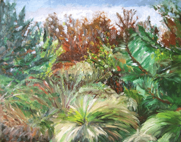
The scene is in full bloom! I was shocked by the growth. The Shipley Nature Center is a tendered preserve and I’m was very happy that nobody has removed any foliage. I’m starting to ‘get’ the background. My approach is becoming more abstract such that the approach is more in tune with values, forms and inter-relationships of color; definitely less than what the object “actual” is. Even though my approach is more abstract I would still like to capture a bit more detail in the foreground.
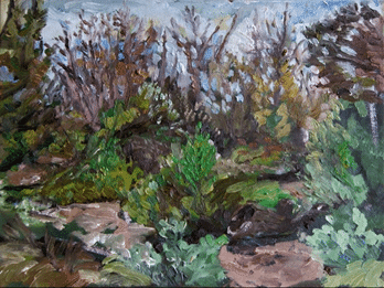
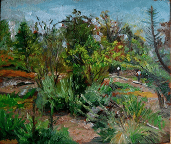
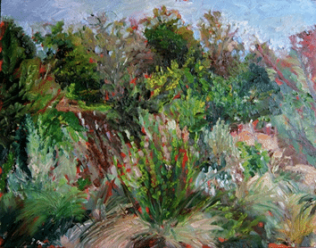
July 2011 – Pleinair 9″ X 11″ oil
A hot and humid day which seems a little early for Huntington Beach, but the plants seem to like it. The scene is fully overgrown, almost to a fault. I would not have picked this spot if I seen what it looks like today. When I first saw the overgrowth, I thought, ‘How am I going to paint this’? In any case it turned out to be one of the most rewarding painting to date. I like to mark making that the scene demanded and rich variety of colors, inter-related shapes an dark deep values. I also like the depth of field.
August 2011 – Pleinair 9″ X 11″ oil
This was a very gloomy day, with a heavy layer of fog. I painted from 9:00am to 12:00pm and by the time I was done the overcast had burned off. This presupposes the problem of huge light an color shifts while painting. Monet used to carry more than one canvas at a time to avoid this problem and at the same time capture the mood, but alas I had only one canvas. In any case, I like the distribution color and the force of nature that comes through.
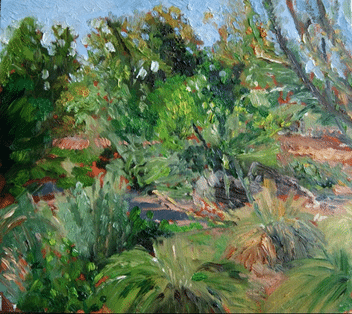
September 2011 – Pleinair 9″ X 11″ oil
This was actually a very pleasant date. Though the sun was out it was nice and cool. (a few days later it was very hot). The foliage is overgrown and the middle ground is nearly covered. This forced me to focus a bit more on the foreground objects. The big change continued to be the abstract way I’m approaching the application of paint; it is put on thick and direct. I’m also enjoying the mark making and freedom of the brush stroke. The background interplay between the sky and the trees was a challenge; I now understand the struggle Cezzane continued to work with throughout is life
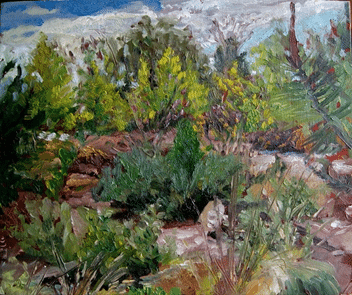
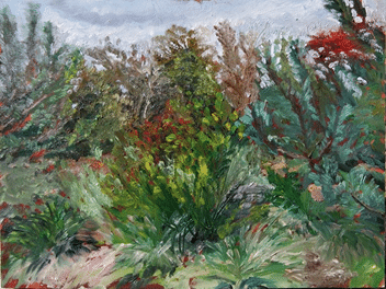
October 2011 – Pleinair 9″ X 11″ oil
This was an extremely hot day and difficult to paint in. I also forgot some items I like to work with, such as latex gloves and a trash bag, so my attitude was a little bent. In any case, the foliage again has grown, but added the challenge of painting objects very close to me as well as the background tree at a distance. The plants have turned a shade of white and there was little ground to be seen. The warmth of the ground helps to balance the coolness of the foliage, so the white had to be used as a warming element. The trees in the background are starting to change color (never changes much in southern California) and are losing their leaves, this allow a lot of light to poke through them causing a provision of lite shadows; beautiful
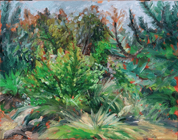
November 2011 – Pleinair 9″ X 11″ oil
The landscape is coming around full circle now. When I think of my first painting from Spot 13, I remember the redness of the background trees and that is what I’m beginning to see today. The overgrowth is astonishing which is due to the Director letting it grow, (she was aware of my studies here and didn’t let anyone tend it) In any case, I wanted to keep the free brushwork but put a little effort into capturing the foreground details, and I believe I accomplished that goal fairly well. The painting has some interesting colors and the light of the day comes through. It seems a bit unbalanced though, this is due in large part to the concentrated areas versus the abstract areas. This will become very important when I start the studio painting.
I didn’t paint at the Shipley in December, but instead began to layout my large studio painting which I continue in a subsequent blog “Shipley Nature Center Saga – 2012”.
Thank You for reading this feel free to contact me if you have any questions or would like to purchase any of these paintings.
Every artwork reaches a moment where the artist must take a step back. In Part 10 of my Goyomatsu Mixed Media Bonsai Series, I invited a group of trusted artist friends into the studio to share their honest thoughts on the piece. These critique sessions have become an essential part of my process. There’s something invaluable about receiving input from others who can see what I might be too close to recognize—a “third eye” that brings clarity and insight.
Over time, it’s easy to lose perspective. We become so absorbed in our own work that we can miss imbalances or underdeveloped areas. That’s where the critique circle becomes powerful. It’s not just about receiving advice; it’s about engaging in a collaborative exchange with artists who bring their own years of experience and thoughtful observation to the table.
During this critique, we discussed several aspects of the work:
Color & Pattern Harmony: The group agreed that the color palette was vibrant and well-chosen. They also noted how the stenciled patterns enhanced the background, helping the motif feel unified—so the piece wasn’t just about the tree, but about the space it lives in.
Gradient & Light: There was appreciation for the vertical gradation from top to center, which strengthens the composition by helping the tree stand out.
Suggestions for Refinement: It was recommended that I emphasize the trunk and branching structure more clearly and deepen the negative space between the tree’s forms to improve contrast. The light in the background was praised, and it was suggested that subtle adjustments could make it even more effective in highlighting the tree.
From this input, I chose the suggestions that resonated with me—because critique is not about following every suggestion, but about listening for what rings true. I then re-engaged with the painting, setting up my palette, remixing key colors, and working on selected areas including the branches, negative space, and background lighting.
This session helped me bring the painting to a finished state—not by changing its direction, but by enhancing its clarity and cohesion. It was a reminder that honest, thoughtful critique—when done in a safe and supportive space—is one of the most generous gifts artists can offer each other.
The video concludes with a brief preview of Part 11, the final part of this series, where I’ll share how I mount the completed work for display.
I invite you to watch the video and join me in this step of the journey. And if you’re an artist yourself, I encourage you to open your work up to critique. Not every comment will apply—but the conversation is what sharpens your eye and strengthens your voice.
In this chapter of my How to Create a Bonsai Artwork in Mixed Media series, we move deeper into refinement. Part 9 is where I begin to paint the bonsai tree itself using acrylics—focusing on shadow, light, and the overall character of the Goyomatsu (White Pine).
🎨 From Kanji to Color: A Quick Recap
Since Part 8, I’ve worked on enhancing the background and negative space, using stencils and acrylics to lighten and darken select areas. I also stenciled over the Kanji—a key decision to better integrate the calligraphy into the composition and give it a more unified visual rhythm.
Now, my attention shifts to the tree.
🎨 Managing the Palette: Color as Structure
Before applying any paint, I walk through how I mix my palette—starting with my custom black, a blend of Alizarin Crimson and Phthalo Green. By adjusting the proportions, I can warm or cool the tone, and even neutralize it with a touch of Mars or Ivory Black.
To mix greens, I use this black as a base, then shift it with Lemon Yellow, Cadmium Red or Orange (to warm it), or Ultramarine Blue (to cool it). For lighter values, I add Titanium White. These nuanced mixtures allow for a range of naturalistic foliage tones that bring the tree to life.
🌲 Painting the Bonsai: Foliage, Pot, and Trunk
With the palette set, I begin painting:
Shadowed foliage and branching for depth
A rich, warm brown for the bonsai pot
Final yellow-green highlights to lift the upper foliage and give it energy
Each layer builds on the last, enhancing the overall composition without losing the sketch-like immediacy that pastel brought in the previous stage.
🖼️ Reflection and Critique
I finish this part by stepping back. I place the painting on an easel, take time to reflect, and—most importantly—I plan to bring it to my monthly artist critique group. These sessions are essential to my practice. They allow fresh eyes to offer new perspectives and help me refine the final stages of a piece.
In Part 10, I’ll share how the critique shaped the final touches and brought the work to completion.
⏱️ Video Timeline:
00:00 – Introduction 00:26 – Review of work since Part 8 01:58 – Planned work on tree 02:09 – Palette building and color mixing 04:40 – Painting tree shadows and foliage 07:53 – Highlighting the bonsai pot 09:10 – Final foliage highlights 11:26 – What’s coming in Part 10 12:48 – Support and social links
🙏 Support & Stay Connected
Thanks again for following along with this series. I continue to learn—through painting, through critique, and through your feedback. If you’d like to support or follow the journey:
In Part 8 of my How to Create a Bonsai Artwork in Mixed Media series, we move from destruction to reconstruction. After intentionally breaking down the image in Part 7—a moment I call “Loss”—this chapter begins the delicate act of Gaining it back.
The tree, a Goyomatsu (White Pine), begins to reemerge through the tactile medium of pastel. But first, I sketch a structural guide with Conte Crayon, which helps lay the foundation for proportion and gesture. From there, I use dark pastel tones to define shadows and shape the negative space, slowly breathing life back into the bonsai form.
This is not just about technique—it’s about creative intuition. I intentionally step back and review how far the image has evolved from its origins: a reference photo and an earlier pastel study. That gap, that transformation, is where true creativity lives.
From roots (nebari) to canopy, and even the moss at the base, I explore how warm and cool tones play off each other, subtly anchoring the tree into its imagined world.
This part also came with technical hiccups: sound issues, focus problems, and my head blocking the shot more than once. I offer a sincere apology—but also an honest acknowledgment that I’m still learning to be a better videographer and editor.
Despite these imperfections, the spirit of the work remains strong. I continue to mark the background stencil and draw out the branching, preparing the piece for the next phase. Part 9 will involve fixing the pastel and dialing in the motif with acrylic paint.
🔍 Highlights & Takeaways:
Rediscovering the bonsai form through pastel drawing
Importance of contour and negative space in composition
Warm vs. cool color interactions in foliage and moss
Creative distance from source as a tool for intuition
Honest reflection on the challenges of video-making
As always, thank you for being part of this journey. Each part of this series is more than a tutorial—it’s a window into a living, evolving creative process. I hope it inspires your own.
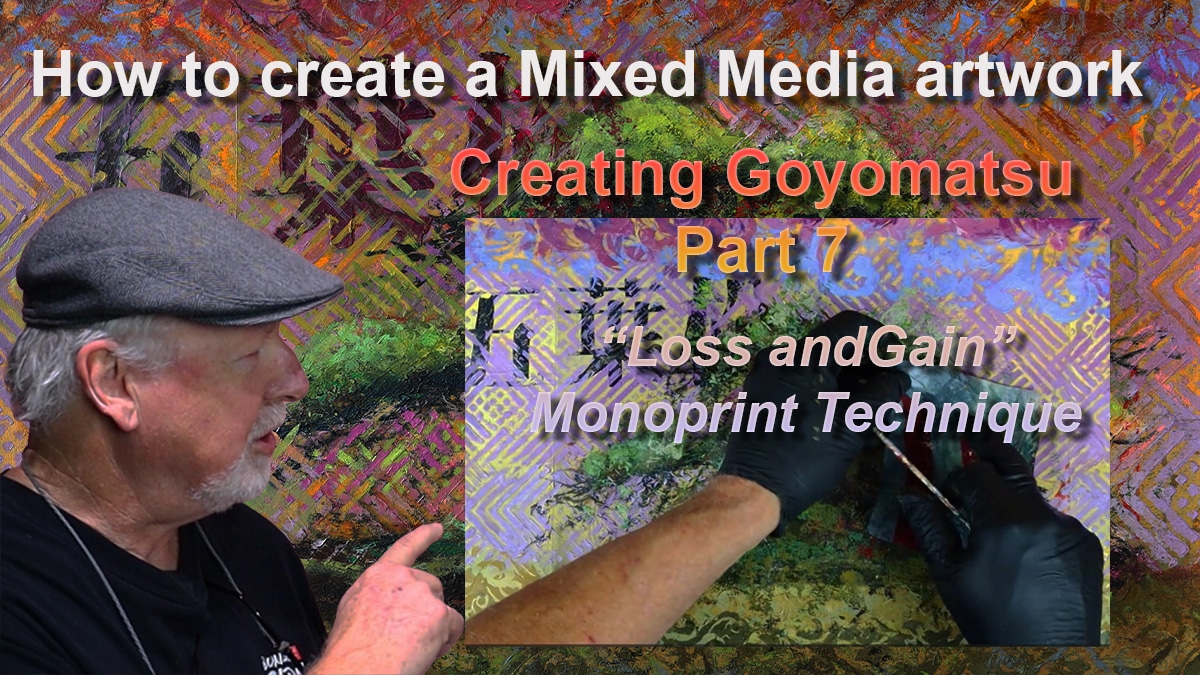
In Part 7 of my ongoing video series on creating a bonsai mixed media artwork, I explore the theme of Loss and Gain through an expressive and intuitive painting process. This stage marks a dramatic and exciting shift in the evolution of the piece, as I embrace letting go of earlier work in order to create something even more dynamic and layered.
Building from the Background
After reviewing the progress made in Part 6—where I created a vibrant background with complementary colors and stencils—I move forward with the monoprint technique. Traditionally, monoprinting involves inking a surface and placing paper on it to create a transferred image. Here, I adapt the method by applying acrylic paint to a cut plastic bag surface, pressing it onto the artwork, and drawing from the back.
The result? Organic, uncontrolled marks that partially obscure the original bonsai image. In doing so, I allow the “loss” of earlier details to set the stage for new energy and expression to “gain” life in the painting.
Inspiration and Application
My approach to this monoprint technique was partly inspired by YouTube artist Dan Tirels (visit his channel here). His process showed me how freeing it can be to let spontaneity guide the next steps.
Using this technique, I focus first on rebuilding the trunk and branching structure of the bonsai. Then, I apply color to the foliage areas, thoughtfully modulating between warm and cool hues and moving across light and dark values to create a balanced but lively surface.
Updating the Kanji and Moving Forward
Once the expressive marks are in place, I return to the Kanji symbol. To better integrate it into the new background, I mix a warm grey tone and re-stencil the Kanji onto the artwork. This small but important update helps pull the piece back together, ensuring that the elements feel united rather than disconnected.
Though happy with the results, I view this phase as another opportunity to respond intuitively to the painting, rather than aiming for “perfection.” In art, as in life, we often must embrace moments of loss to discover even greater gains.
Watch the Full Process
I invite you to watch Part 7 and see the transformation unfold. This stage is filled with insights into embracing the unexpected and letting creativity guide your hand.
Thank you for being part of this journey! I’d love to hear your thoughts—feel free to leave a comment or share how you approach “loss and gain” in your own creative process. Stay tuned for Part 8, where I begin to refine and define the emerging image.
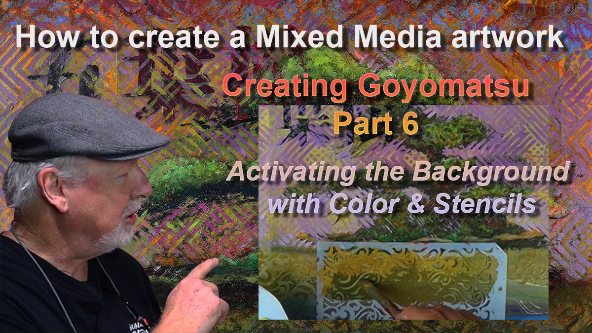
In Part 6 of my video series on creating a bonsai mixed media artwork, the focus shifts to the background. This step builds on the complementary color palette I developed in Part 5. So I begin to energize the painting using layered acrylics and stencils. The result is a vibrant, supportive backdrop that enhances the bonsai image and Kanji symbol without overpowering them.
Starting with Color
I begin by reviewing the color cards selected from the marble paper and use warm tones like Cadmium Yellow Light, Raw Sienna, and Cadmium Orange, and cool tones including Cobalt Blue, Permanent Violet, and Alizarin Crimson. To control value and intensity, I use Ivory Black and Titanium White. This will allow me to lighten or darken any mixture as needed.
Choosing and Placing the Stencils
To create structure and movement in the background, I introduce two types of stencils: geometric patterns for the center and organic patterns for the top and bottom of the painting. I do this so that the geometric stencils can provide a visual counterpoint to the natural forms of the bonsai tree, while the organic stencils hint at elements like wind, clouds, grass, and waves.
Applying the Paint and Building Layers
Using a relaxed, intuitive approach, I begin applying the geometric stencils with acrylic paint in the central area of the composition. Rather than trying to be overly precise, I allow the act of painting to be a bit messy and expressive. This makes the process more enjoyable and keeps the work dynamic.
Next, I move to the top and bottom sections and begin using the organic stencils. I carefully shift the values of the paint from dark to light to keep the viewer’s eye centered on the main subject. Throughout the video, I also show how I mix on the palette to control color temperature, intensity, and value.
The Background as a Supporting Character
This part of the process is not just about adding decoration—it’s about shaping a background that acts as a strong supporting character in the composition. Through thoughtful use of color and layered patterns, the background now feels alive and integrated with the bonsai image.
Watch the Full Process
This video offers practical insights into painting technique and creative decision-making. Whether you’re working in mixed media or another medium, I hope it gives you ideas to apply in your own process.
Feel free to leave a comment or question—I’d love to hear your thoughts or answer anything you’re curious about. The next video, Part 7, will dive into the theme of Loss and Gain, a reflective phase of this journey.
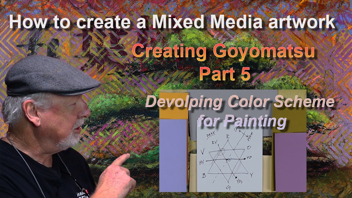
In Part 5 of my ongoing series on creating a mixed media artwork featuring a White Pine (Goyomatsu) bonsai, I take a deep dive into the process of developing a color scheme and applying watercolor gradation. This step brings new life to the transferred image and lays the groundwork for the visual mood of the piece.
Finding Color in the Marble Paper
The color scheme is first inspired by the colors already present in the marble paper. By selecting color cards that reflect the natural hues in the paper—like light yellow and mid-tone grey—I begin to define a palette. As I explore the paper more closely, additional colors are identified: a warm yellow-orange and a cool yellow-green. These become the basis for a broader range of complementary hues.
Using the Color Wheel and Value Study
With the key colors selected, I use a color wheel to find their complements. By drawing one triangle with primary colors (red, blue, yellow) and another with secondary colors (green, orange, violet), I can map where each selected color lies and find its opposite. From there, I look at each color’s value—whether it’s light or dark—and its temperature—whether it feels warm or cool.
This exercise not only supports the development of harmony in the artwork but also allows me to make informed choices before adding any paint to the surface.
Inspiration from Ukiyo-e Prints
As I reflect on historical influences, the art of Ukiyo-e Japanese prints comes to mind. These works often use strong gradations of color to guide the eye and focus attention on the center of the composition. Drawing inspiration from this technique, I begin applying watercolor washes from top and bottom edges, gradually lightening as they reach the center.
Applying Watercolor and Creating Focus
With the color decisions made and Ukiyo-e in mind, I start painting. Using watercolor, I work from dark to light, blending the tones smoothly across the paper. This not only enhances the background but also builds a visual rhythm that supports the bonsai and kanji elements.
The result is a gentle yet powerful transition of color that centers the viewer’s attention and begins to reveal the emotion and atmosphere of the final piece.
Watch the Full Process on YouTube
You can see the entire process step-by-step in my latest video, including the tools, techniques, and reasoning behind each choice:
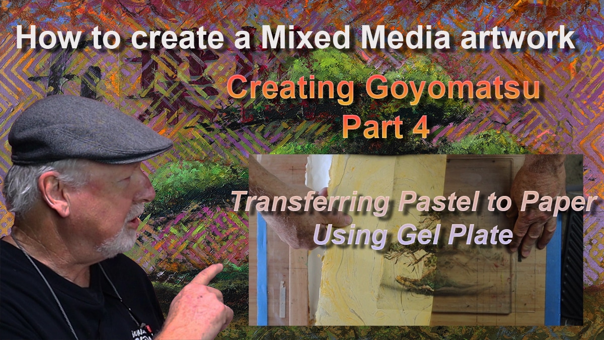
Creating a mixed media bonsai artwork has been an intricate process, and in Part 4 of my series, the pastel drawing is transferred onto marble paper using a Gel Plate. This method provides texture and depth while preserving the delicate details of the original drawing.
The Process of Transferring the Pastel Drawing
To begin, the pastel drawing is reviewed alongside the Gel Plate from Gel Press. Understanding how the plate interacts with the pastel surface is essential before making the transfer.
The registration of the plate is carefully considered to ensure proper alignment on the paper. Precision is key in positioning the artwork correctly so that the final composition remains balanced. Once aligned, the pastel drawing is pressed onto the Gel Plate by hand, ensuring an even transfer.
Upon lifting the pastel from the plate, the success of the transfer is assessed. A thin layer of Liquitex Acrylic Medium is then applied to the plate, preparing it for the final transfer to marble paper. The paper is placed onto the Gel Plate, and a Yasutomo Baren is used to press down evenly, securing the image onto the surface. To set the transfer, a Masonite board and magazines are added for weight, allowing the medium to fully adhere.
After 10 to 15 minutes, the board and magazines are removed. The marble paper is carefully peeled back, revealing the transferred pastel bonsai image. The outcome is examined, ensuring that the integrity of the drawing has been maintained while benefiting from the new texture and depth.
Adding the Kanji Element
To complement the bonsai image, a Kanji stencil is created. A print of the Kanji is bonded onto cardstock and meticulously cut out using an Exacto knife. Once the stencil is complete, it is placed onto a smaller Gel Plate, and DaVinci Black Acrylic Paint is applied. The stencil is removed, leaving a crisp Kanji impression, which is left to dry.
Once dried, a thin layer of Liquitex Acrylic Medium is applied over the Kanji, and the plate is placed onto the marble paper in the designated position. After being weighted down and left to sit for 10 to 15 minutes, the plate is lifted, revealing the transferred Kanji. The integration of the bonsai and Kanji creates a meaningful composition that reflects both nature and cultural symbolism.
Final Thoughts & Next Steps
The transfer process brings a new dimension to the artwork, blending texture, layering, and mixed media techniques. Each step contributes to the evolution of the piece, making it more dynamic and engaging.
The next video will explore the selection of color and a discussion on the influence of Ukiyo-e aesthetics in the final artwork. As always, feedback is welcomed and appreciated. I’d love to hear your thoughts on the video and process! What did you find most interesting? Let me know in the comments or on my social media pages.
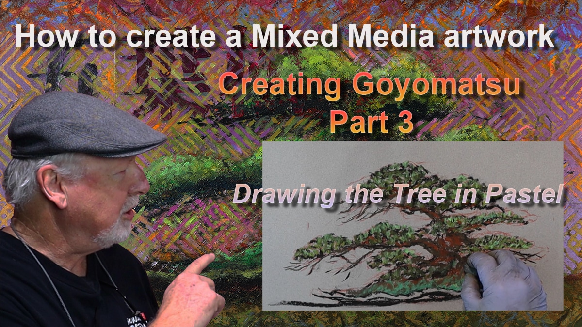
Creating a mixed media artwork is a journey of layering, refinement, and thoughtful composition. In Part Three of my How to Create a Bonsai Mixed Media Artwork series, I focus on drawing the Raft Style Goyomatsu White Pine in pastel. This next step helps establish the tree’s form, depth, and color harmony before transferring the image onto marble paper in the next phase.
From Sketch to Pastel: A Vital Step in the Process
Now before applying pastel, I revisit the layout plan from Part 1 to determine the tree’s ideal size and placement. Using Strathmore 500 Series grey paper, I measure the correct dimensions and begin with a detailed drawing in Conte à Paris Sanguine. This foundation sets the stage for a more refined and expressive pastel composition.
Building Depth with Pastel Techniques
Working from dark to light, I layer pastels to enhance contrast and dimension. I first establish the darkest areas of the tree, ensuring a strong structural base. Gradually, I introduce mid-tones and highlights, carefully balancing warm and cool colors to create a dynamic yet harmonious composition. By maintaining a consistent light source, the bonsai takes on a realistic yet artistic presence.
Bringing Motion and Harmony to the Composition
A bonsai tree’s movement is essential to its beauty. I focus on how the trunk line flows, guiding the viewer’s eye through the composition. The positioning of branches and the distribution of foliage are carefully considered to maintain balance. This attention to detail ensures that the final artwork will feel natural and engaging.
What’s Next? Preparing for the Transfer Process
This pastel drawing serves as a stepping stone for Part 4, where I will demonstrate how to transfer the image onto marble paper using a Gelli plate. This next phase will add texture and depth, making the artwork a true mixed media piece.
Follow Along & Stay Connected
I invite you to follow my journey in creating this unique bonsai artwork. Watch the full video on YouTube, and don’t forget to subscribe for updates on the next steps!
Question, Have you ever worked with pastel before? Let me know in the comments! Your thoughts and shares help bring this creative process to more art lovers!
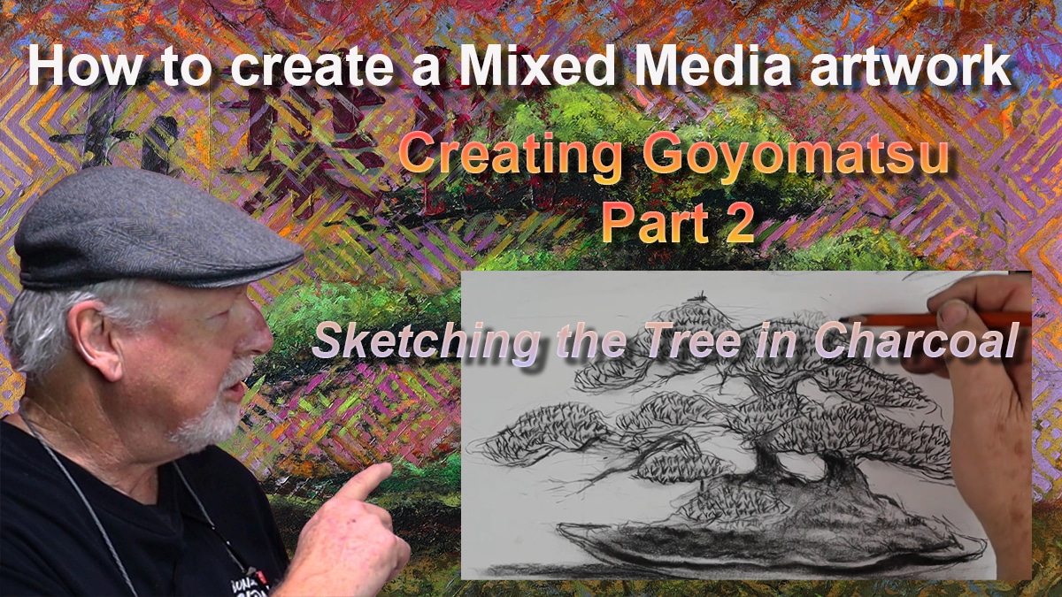
Creating art is a journey, and every piece begins with understanding its subject. In Part Two of my mixed media series, I focus on a detailed charcoal sketch of the Raft Style “Goyomatsu” White Pine. This step helps me connect with the tree and refine the vision for my final artwork.
To start, I revisit the rule of thirds, a fundamental tool for achieving balance in composition. Positioning key elements accordingly, I can thereby ensure harmony within the piece. Next, I define the trunk line, evaluating what works and what needs adjustment. This exploration allows me to make thoughtful decisions about the tree’s structure.
Moving forward, I lay out the secondary branches while considering traditional bonsai styling principles. These branches play a crucial role in conveying movement and natural growth. Then, I explore the base of the trunk, or nabari, observing how it meets the ground and interacts with the clam-shell pot. The final stage of the sketch focuses on the foliage mass and texture, bringing the tree to life.
Each step in this process is intentional. Sketching allows me to refine my approach before committing to the final mixed media piece. This study will guide me as I transition to pastel drawing in Part Three.
Why Sketching Matters in the Artistic Process
Sketching is the bridge between inspiration and execution. It allows an artist to observe, analyze, and interpret before committing to a final piece. For this artwork, I needed to study the bonsai tree in depth—its structure, movement, and balance—so that my final mixed media composition would not just depict the tree but capture its essence.
By creating this charcoal study, I familiarize myself with the trunk line, explore how it interacts with the ground and pot, and refine the branching structure. These foundational decisions will guide the next phase—bringing the tree to life in pastel.
Building on Composition: The Rule of Thirds
A strong composition is key to creating a compelling artwork. I begin this sketch by referencing the Rule of Thirds, a classic compositional tool that ensures balance and harmony within a piece. This method helps me position the tree in a way that feels both natural and aesthetically pleasing.
Breaking Down the Sketching Process
In the video, I take you step by step through the process of sketching the tree:
Defining the trunk line – Establishing the flow and energy of the tree.
Laying out the secondary branches – Exploring how the tree’s movement is expressed through its structure.
Outlining the base (Nabari) and pot – Connecting the tree to its environment.
Shaping the foliage mass and texture – Giving the tree depth and life.
By carefully working through each element, I ensure that the final artwork is not just an accurate representation but a dynamic and thoughtful interpretation of the tree’s unique form.
Looking Ahead: From Sketch to Pastel
This charcoal sketch is not the end—it is a stepping stone. In Part Three of the series, I will take this study and translate it into pastel, further refining the tree and deepening its presence within the composition.
Join the Journey
Art is about process, exploration, and continuous learning. I invite you to follow along as I document this creative journey, sharing insights into how an artwork takes shape from concept to completion.
I began this project with a deep appreciation for the Goyomatsu bonsai. Its multi-trunk form symbolizes strength and balance. The idea to pair it with the elegant kanji for “Goyomatsu” came naturally. I wanted to create a dialogue between tradition and nature.
The marble paper provided the perfect background. Its organic patterns complemented the bonsai’s fluid form. Choosing the right floating frame was also essential. I needed a frame that would elevate the finished piece and give it the attention it deserved.
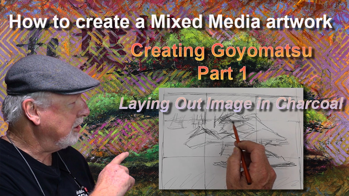
Planning the Composition
I carefully laid out the composition using the Rule of Thirds. This approach helped balance the elements within the artwork. Sketching the bonsai in charcoal allowed me to capture its dynamic structure. Next, I positioned the kanji to maintain visual harmony.
Developing the Artwork
A value study came next. This helped assess the light and dark areas to ensure depth. Compressed charcoal added bold, rich tones. I experimented with different background textures and marks to create a layered, dynamic feel.
Inspiring Creativity
This video series aims to be instructional. I hope to inspire viewers to create their own artwork or simply enjoy the process. There’s beauty in both bonsai and creativity, and I’m excited to share this journey.
Stay tuned for more updates as this project unfolds. Let’s explore the creative possibilities together.
Thank you for joining me on this journey!
Don’t forget to check out my other videos and subscribe to my channel for more art tips and tutorials!