Perspective is the way we seeing things from our point of view. This video discusses in detail how perspective, specifically ‘Linear Perspective’, influence our Bonsai Drawing and our Bonsai development. We begin with a fundamental understanding of one-point and two-point perspective. I show how of a horizon line and vanishing points originate from our point of view and how objects occupy our ‘Field of View’; i.e why objects look larger the closer they are to you.
Applying perspective to our drawing gives the artist the technique for showing objects in space; I illustrate this using a Bonsai Pot. When drawing a Bonsai Tree showing the pot accurately in space can give the drawing a sense of reality. The video also discusses in detail ‘Foreshortening’ and how that influences Bonsai Artist to develop Bonsai Trees with large bases and exaggerated taper. In addition, the concept of perspective also plays a role on how l we layout our Forest Plantings called ‘Saikei’. The video finishes with a short demo on how I trim my forest plantings and how perspective influences my decision making.
Though perspective is conceptually “easy” to understand, practically it can be very difficult to apply. My goal in this video is to remove some of that complication and provide a simple way of applying it to our drawing and bonsai development.
In 2011 I started on a journey that continues to this day. Below is an account of the start of this journey into a life time at the Shipley Nature Center in Huntington Beach
If you are interested in purchasing one of the pleinairs please contact me at reekersart@gmail.com and I let you know availability. Purchase price is $300 with free shipping.
Pleinair setup at Spot 13, sometime in 2011
The conceived of this series as a way to understand how nature changes with time here in Southern California, and how my learning of the scene changes with it. The goal is to have completed a series of 12 paintings that illustrate how art can be used as a learning tool and accomplish great esthetics when one understands and feels a vista. The agenda will be to go out the the Shipley Nature Center in Huntington Beach California and paint a plienaire painting (on-location) every month. It is important to paint from the same spot every time; Spot 13 as disignated by a marker at the Center. My intent is to finish this location completely with studio work to be performed in 2012.
This is a photo of the scene taken in July 2011, it gives you a general idea of the Spot 13. I choose the spot because I wanted a location that was foliage rich and not your ‘traditional’ landscape vista. In this way, I would have to respond to the changing of the natural foliage throughout the year.
January 2011 – Pleinair 9″ X 11″ oil
This was the first painting at Shipley. It was an introduction to the scene and place. What I like about this painting is the light moving through the scene and the brushstroke are looser than my past pleinair paintings.
Feburary 2011 – Pleinair 9″ X 11″ oil
Trees are beginning to fill out though relatively spares. Some flower’s are beginning to bloom which was exciting and began to saturate my pallet. I like how things are beginning to warm up and those violet flowers.
March 2011 – Pleinair 9″ X 11″ oil
A very strange day, the clouds were heavy and there was a constant change in light. The foreground continues to be expressly derived and the middle ground is looking more distinct and integrated.
April 2011 – Pleinair 9″ X 11″ oil
This was a very melancholy day and rather dark. It seems the changing of the season is creating a level of anticipation in the plants. I learned a lot on this trip, more what not to do than what to do though. Having been more familiar with the scene I thought that I could blocked in the scene quickly and then free-form on details. I ended up trying not to muddy up the painting from the under paint. In any case I like the energetic mark making.
May 2011 – Pleinair 9″ X 11″ oil
An absolute beautiful day; the best so far. The flowers buds look happy and ready to bloom, the foliage is filling out and finally the background trees are full and robust. The previous month taught me much about approaching the scene in a holistic manner. I was not worried about blocking in and allowed the under stain to peak through.
June 2011 – Pleinair 9″ X 11″ oil
The scene is in full bloom! I was shocked by the growth. The Shipley Nature Center is a tendered preserve and I’m was very happy that nobody has removed any foliage. I’m starting to ‘get’ the background. My approach is becoming more abstract such that the approach is more in tune with values, forms and inter-relationships of color; definitely less than what the object “actual” is. Even though my approach is more abstract I would still like to capture a bit more detail in the foreground.
July 2011 – Pleinair 9″ X 11″ oil
A hot and humid day which seems a little early for Huntington Beach, but the plants seem to like it. The scene is fully overgrown, almost to a fault. I would not have picked this spot if I seen what it looks like today. When I first saw the overgrowth, I thought, ‘How am I going to paint this’? In any case it turned out to be one of the most rewarding painting to date. I like to mark making that the scene demanded and rich variety of colors, inter-related shapes an dark deep values. I also like the depth of field.
August 2011 – Pleinair 9″ X 11″ oil
This was a very gloomy day, with a heavy layer of fog. I painted from 9:00am to 12:00pm and by the time I was done the overcast had burned off. This presupposes the problem of huge light an color shifts while painting. Monet used to carry more than one canvas at a time to avoid this problem and at the same time capture the mood, but alas I had only one canvas. In any case, I like the distribution color and the force of nature that comes through.
September 2011 – Pleinair 9″ X 11″ oil
This was actually a very pleasant date. Though the sun was out it was nice and cool. (a few days later it was very hot). The foliage is overgrown and the middle ground is nearly covered. This forced me to focus a bit more on the foreground objects. The big change continued to be the abstract way I’m approaching the application of paint; it is put on thick and direct. I’m also enjoying the mark making and freedom of the brush stroke. The background interplay between the sky and the trees was a challenge; I now understand the struggle Cezzane continued to work with throughout is life
October 2011 – Pleinair 9″ X 11″ oil
This was an extremely hot day and difficult to paint in. I also forgot some items I like to work with, such as latex gloves and a trash bag, so my attitude was a little bent. In any case, the foliage again has grown, but added the challenge of painting objects very close to me as well as the background tree at a distance. The plants have turned a shade of white and there was little ground to be seen. The warmth of the ground helps to balance the coolness of the foliage, so the white had to be used as a warming element. The trees in the background are starting to change color (never changes much in southern California) and are losing their leaves, this allow a lot of light to poke through them causing a provision of lite shadows; beautiful
November 2011 – Pleinair 9″ X 11″ oil
The landscape is coming around full circle now. When I think of my first painting from Spot 13, I remember the redness of the background trees and that is what I’m beginning to see today. The overgrowth is astonishing which is due to the Director letting it grow, (she was aware of my studies here and didn’t let anyone tend it) In any case, I wanted to keep the free brushwork but put a little effort into capturing the foreground details, and I believe I accomplished that goal fairly well. The painting has some interesting colors and the light of the day comes through. It seems a bit unbalanced though, this is due in large part to the concentrated areas versus the abstract areas. This will become very important when I start the studio painting.
I didn’t paint at the Shipley in December, but instead began to layout my large studio painting which I continue in a subsequent blog “Shipley Nature Center Saga – 2012”.
Thank You for reading this feel free to contact me if you have any questions or would like to purchase any of these paintings.
🎥 Video Description: Join me on a captivating journey into the world of Bonsai as I unveil the artistry behind crafting a stunning dead wood feature, known as a Jin, on a California Juniper Bonsai.
🌳 In this video will show you the meticulous process of revealing the hidden structure of the bonsai by delicately removing foliage, offering a unique perspective on its form. 🌿
🔍 Key Highlights:
00:30:00 Observing the tree
01:30:00 🌲Foliage Removal: Begin to reveal the Jin structure and define it place in the Bonsai composition.
02:45:00 🌲 Bark Removal: Explore the transformative moment as I skillfully remove the bark, exposing the raw and intricate wood beneath.
06:30:00 🛠️ Power Tools in Action: Dive into the creative process as power tools come into play, shaping the surface textures with precision and finesse.
10:30:00 🌅 Preservation Magic: Witness the preservation journey, transforming the wood into a warm, inviting hue that adds character and depth to the feature.
14:16:00 🎨 Beautiful Finish: Immerse yourself in the final reveal as the California Juniper Bonsai showcases a breathtaking dead wood feature, elevating its overall aesthetic. Whether you’re a Bonsai enthusiast or simply curious about the art of sculpting nature, this video offers an intimate look at the craftsmanship involved in creating a captivating Jin on a California Juniper Bonsai. 🌟
As we conclude this journey into the heart of Bonsai artistry, I hope the transformative process of creating a Juniper Jin has ignited your passion. Remember, each tree tells a unique story, and with the right techniques, you can craft your own enchanting ‘deadwood’ features. May this video inspire you to explore, create, and continue the joyful journey of Bonsai. Happy sculpting, fellow Bonsai enthusiasts! 🌳✨ #BonsaiInspiration #JuniperJin
This instruction video shows you how I approach bonsai drawing in pastel. I start off with a sketch on black Canson pastel paper. I like using black because it act as a line as I progress with the drawing. To do the sketch I use a red pastel pencil. The layout of the sketch is important to define how the viewer will move their eye along the artwork. This generally starts at the intersection between the trunk of the tree and the soil. I like to start with a circular motion from there and into the foliage. I find laying out the detail is also important at this stage since it will dictate the texture.
When I complete the layout, it will give me a roadmap of how to proceed with the application of the pastel. When starting with the pastel I like using the darker colors first. This creates a base in which I can start to build my colors. I will lightly blend the color into the paper. To determine the colors that I will use in the motif, I have a set of color cards and compare these cards to the base colors. This helps save time since I don’t have to search through my large array of pastels. Once I determine the colors, I can then compare the pastels to the cards. You will see how I use the side of the drawing to look at how those colors look on the black paper. I enjoy applying the pastel around the object. The negative space defines the object (positive space). I can see how well they are working together at this stage. I love the way pastel lends itself to blending. I can create a soft light and ethereal background by rubbing the color transitions.
The rest of the time is finishing the work up to your satisfaction. I like to think of this as scratching the artwork until in itches no more
This video describes for you in detail how I structure my values within a Charcoal drawing. Value Structure in a drawing is a measurement between light values (high key) to dark values (low key). By modulating your those values one can create drama, textural effects and depth of space. The name of the drawing I’m demonstrating on is “Walk Bridge”. My charcoal drawing is for an art show at the San Diego Japanese Friendship Garden in Balboa Park. The exhibit is from November 2021 to January 2022.
These are the materials I used:
Strathmore 400 Series Smooth Surface Paper
General’s PurePowder Charcoal
Winsor Newton (vine) Willow Charcoal Sticks
Chamois
Kneaded Rubber
I like to start out with my area of focus; in this case the walkway bridge. I begin removing the charcoal with the chamois. I work in this method in this as a way to not “fuss” with detail, much like using a large brush will do. From the bridge, I begin removing charcoal to create a circular composition. This is a classical approach where you can move the eye around the subject. The chamois creates a nice soft edge. Soft edges will produce the illusion of light wrapping around objects. These edges will create transitions (passages) from background to foreground.
I hope you enjoy this video. Feel free to contact me if you have any question.
This video is a detail instructional video on how to print from an etched plate. The process is called “Intaglio” which is a process where the image is produced from the etched portion of the plate by apply ink to the plate. The video itself was a live video produced with the help of my friend Richard Chau-Davis and can be seen in full at https://www.crowdcast.io/e/rreekers-1. The video is an edited version with descriptions along to way to help the viewer understand the process better.
We start with the paper preparation and how to tear the paper instead of cutting with scissors to create the size we need. The paper used is Arches BFK Rive, fine grain, acid free 280g, 100% cotton page (sometimes referred to a rag paper). After the paper is torn to size we need it is put into a vat of water for approximate 20 minutes minimum.
We move to the inking station and begin the preparation of the ink. I start by applying Art Cream Guard from Winsor Newton to my hand and putting on Latex or Nitrile gloves. The ink used here is Graphic Chemical and Ink co. 1lb Perfect Palette Intense Black. We first begin by warming the ink up by continually mixing it on the glass palette using a putty knife. I demonstrate the effect of the ink by adding clear oil (Huile Claire from Charbornel) which will make the ink less viscous (more runny); this is done partially if your ink is too stiff. In order to reduce the “oiliness” of the ink I add Magnesium Carbonate purchased from Daniel Smith, it absorbs some of the oil without compromising the ink opacity. A tack test is done by placing the putty knife on the ink and then lifting to see the length of the ink stream. Once the right viscosity is made (personal preference) I then add Vaseline to reduce the task (stickiness of the ink), again this is done to feel. Finally, I add Easy Wipe from Graphic Chemical and Ink co. This will make the removal of the ink from the plate surface easier. Note: there are inks that don’t need to be modified, but in my experience, temperature and relative humidity plays a big part in the inks characteristics, so understanding these techniques for modifying your ink is important.
Once the ink is prepared I can then ink the plate using cards (collected from the mail). I softly run the ink in all four directions to fully cover the plate. I clean up the edges using toilet paper and then ‘stamp’ the plate using old Yellow Paper pages to further distribute the ink evenly. In order to remove the ink from the copper surface I use Tarlatan (can be purchased at most print supply stores) and then graduate to Yellow Page paper and finally my palm (which is why I applied Guard Cream). The fat part of the palm lightly pats the plate surface. When all the ink from the surface is removed to my satisfaction I can now print the plate.
I have a Charles Brand press which I have preset to the height I need as well as mark the bed for the plate and paper placement. With clean hands (I tend to wash my hands before ever touching the paper) I remove the paper from the soaking tray and blot using clean towels. I have a large roller and usually roll back and forth about 3 times. The damp paper is then aligned and placed over the plate. I covered the paper with the press blankets and roll the press bar over the plate. The final product is the print!
A production of prints can then be made. I make a series of 100 prints in which all prints need to be exactly the same. I do each session in tens and remove any anomalous prints (these are later made into monoprints). In this way, the buyer is assured to have a print of the series without flaws. In addition, the Buyer is assured I printed all prints in the series by hand.
I hope this process is clear to the viewer. There are different methods available, but for me, this method works the best. Please email me at reekersart@gmail.com if you have any comments or questions.
Below is a list of material used in video:
Paper – Arches BFK Rives, Fine Grain, Acid Free, 100% Cotton, 280g
Vaseline Petroleum Jelly
Easy Wipe – Graphic Chemical and Ink co.
Ink – 1lb Perfect Palette Intense Black, Graphic Chemical and Ink co.
Instructional video on understanding Perception in Bonsai Drawing
Perception is a subject studied by Philosophers and Artist throughout the ages. Maurice Merleau-Ponty in his book ‘Phenomenology of Perception’ writes how Perception is the background of experience. Artist looks at Perception as a relationship between what we see and a clear understanding of that experience; in our case the viewing of a Bonsai Tree. In this video I take on that subject of Perception and how it can help you understand ‘what you see’ and translate that to a drawing descriptively and clearly.
One way of understanding “Perception” is to explore the phenomenon on how we see an object and how we interpret it in space. As a child we draw the world flat and symbolically, whereas when we mature, and experience the world 3-dimensionally, we begin to “describe” the world more in terms of space; this is reflected in how we approach drawing. The drawings created by the child is therefore much different that of an adult.
This video illustrates that they’re learnable tools that can help us define a descriptive space such that overlapping items, removing ambiguity, detailing and value shifting in the motif can better illustrate the tree we are drawing in a mature way.
I sincerely hope this video clarifies your understanding of Perception in drawing and furthers your interest in our goal to help accurately draw your Bonsai tree. Most importantly further your enjoyment of the beautiful Art of Bonsai.
Instructional video on methods for drawing your Bonsai
In this video I discuss the 3 types of Bonsai drawings; Symbolic, Imaged and Descriptive. The video uses a Femina Juniper Bonsai as our ‘model’ and discusses the method for drawing in these 3 particular types, as well as the Pros and Cons for these methods.
In drawing a Bonsai Tree (or anything for that matter) we use all three types of drawing in one way or another. This video, and subsequent videos, will show how to recognize your approach and ultimately give you a good understand on how to do your own drawings within your own aesthetics.
My method is to tilted towards the descriptive way of drawing for getting a better understanding of “seeing” and a better method for understanding and visually experiencing your tree. The goal is to increase your appreciation for the beautiful world of Bonsai and help you develop the tool of drawing to increase your experience of Bonsai.
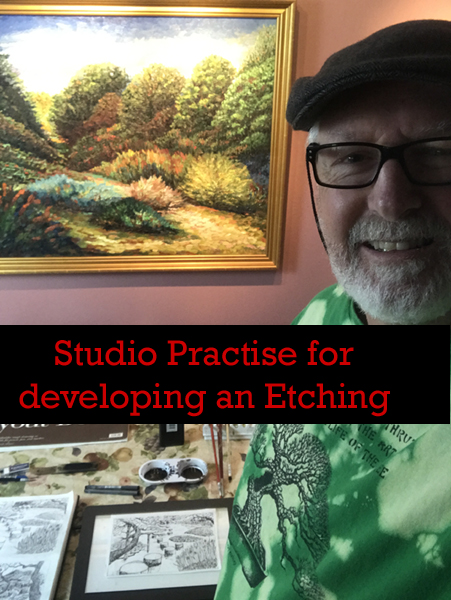
This is a video blog that goes into detail how I approach an etching for my Japanese Garden Series. The video shows how I develop the plate by first etching into it the motif, then to develop the value structure through aqua-tinting.
This is Part 2 of a 2 Part video series (see https://www.reekersart.com/video-blog-prep-work-for-an-etching/)
Thank you so much for checking this out. Please feel free to contact me if you have any questions and be sure to subscribe to my mailing list. If you a interested in purchasing a print please go to https://www.reekersart.com/product-category/prints/
This is an Interview by Diane Pendergast from the SocalPapa Pleinair painting group for an upcoming online show of Back Bay and OC Parks . Each year there is a pop-up show, but due to the corona virus on July 11th to 19th they will have an online show. There is talk of having actual pieces in the show but since the Muth Conservatory is where it is shown, it is high unlikely that it will be available.
The interview is about 7 minutes long and disusses my plienair painting experience, general ideas regarding painting outdoors in Southern California, and the painting that was submitted to the show.
This is a video blog that goes into detail how I approach an etching for my Japanese Garden Series. The video shows how I use photos that my wife or I took of our travels through Japan and how in my sketchbook (along with other sketches) I create a motif. I subsequently transfer that motif to bond paper in order to create a detail pen and ink drawing. The P&I drawing helps me define my line-work and textures that will be drawn on the plate. I then create an ink-wash painting to help me with an “aqua-tinting plan”. The video will describe the medium and tools that are used. From that, all is complete to create the etching motif.
This is Part 1 of a 2 Part video which will cover the actual development of the plate and how I used the prep-work to accomplish it.
Thank you so much for checking this out. Please feel free to contact me if you have any questions and be sure to subscribe to my mailing list.
Cheers
Keep up to date with sales, new work, and Patreon updates